The Zepp Z is a great looking watch wrapped in titanium, if only it could figure out notifications and apps.
I enjoy smartwatches and the various use cases available, so when I was given the opportunity to do a Zepp Z review, I was all in. My daily driver in terms of wearables is a Wear OS watch in the TicWatch Pro 3, but I also will occasionally switch over to Tizen and use the Samsung Galaxy Active 2.
What intrigued me about the new Zepp Z was the prospect of using a device that was of high-quality and running an operating system that was outside of the "big two" mentioned above. If you aren't familiar with the Zepp name, don't worry, I wasn't either, the brand is under the same umbrella as Amazfit. Like Amazfit, the Z has a big focus on personal well-being with a multitude of sensors and software features to help you monitor your overall health.
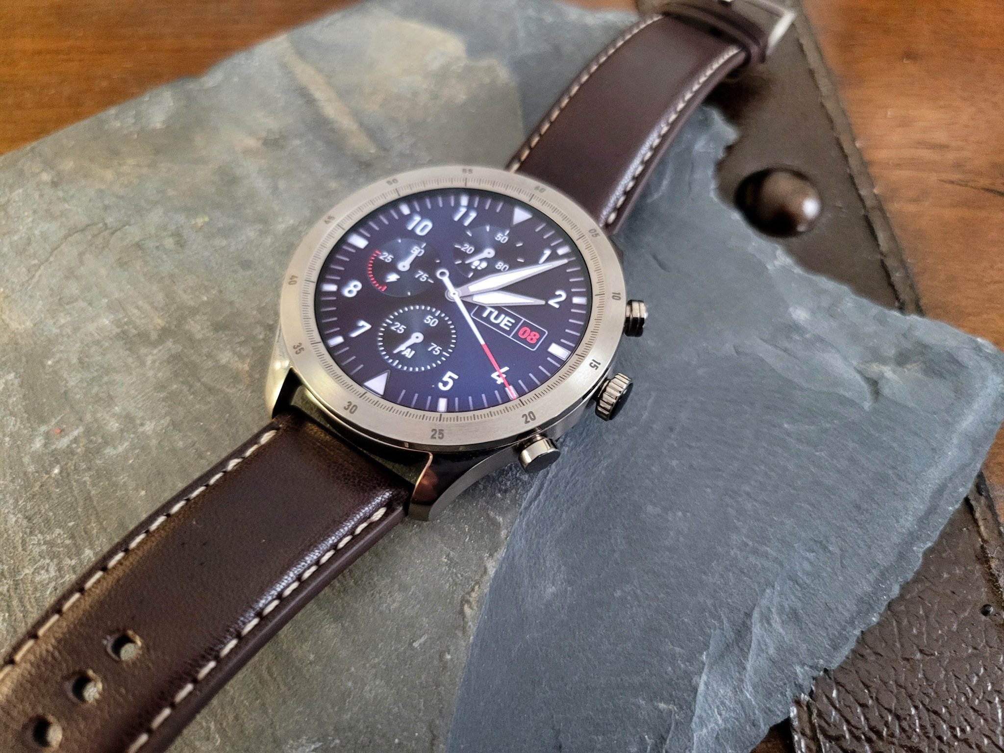
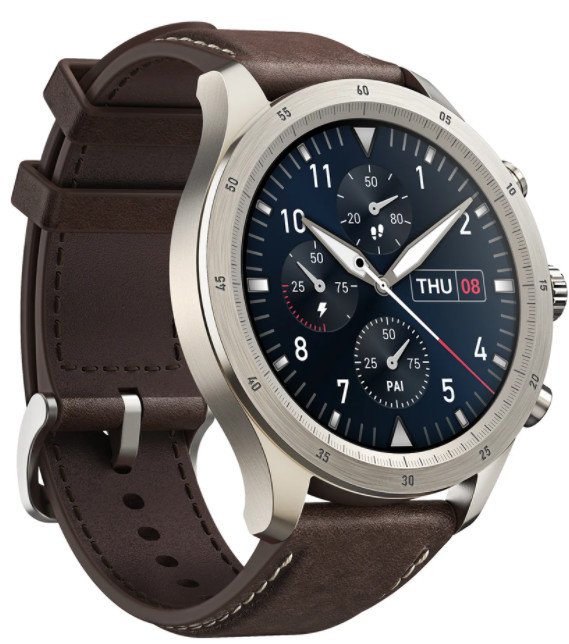
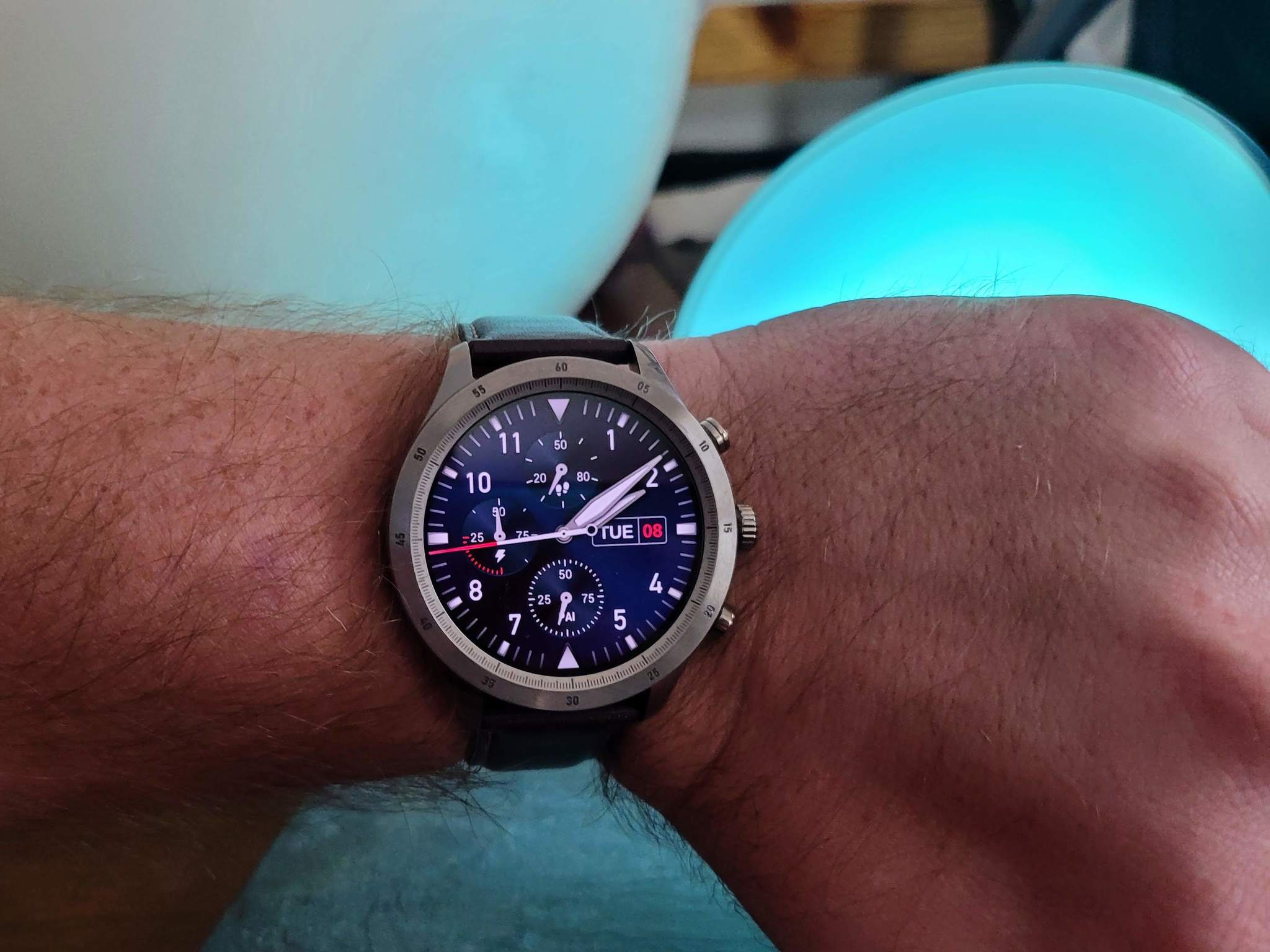
The Zepp Z is taking a premium approach as a health and fitness device by building the case from a titanium alloy and including a brown leather watch band. It's also promoting 15 to 30 days of battery life to save you from dead watch anxiety. In my three weeks using the Zepp Z as my daily smartwatch, I found a lot to like about the device and a few things that could use quite a bit of help.
Zepp Z
Bottom line: Zepp Z is a very well built watch with great health tracking features and some unique software tricks. The lack of an app ecosystem and poor handling of notifications is a downer though.
The Good
- Very nice hardware
- Great haptics
- Unique software features
- Lots of health tracking metrics
- Excellent battery life
The Bad
- Notifications needs work
- Dedicated health key doesn't always work
- Missing ECG capability
- No third-party apps
Zepp Z: What I like
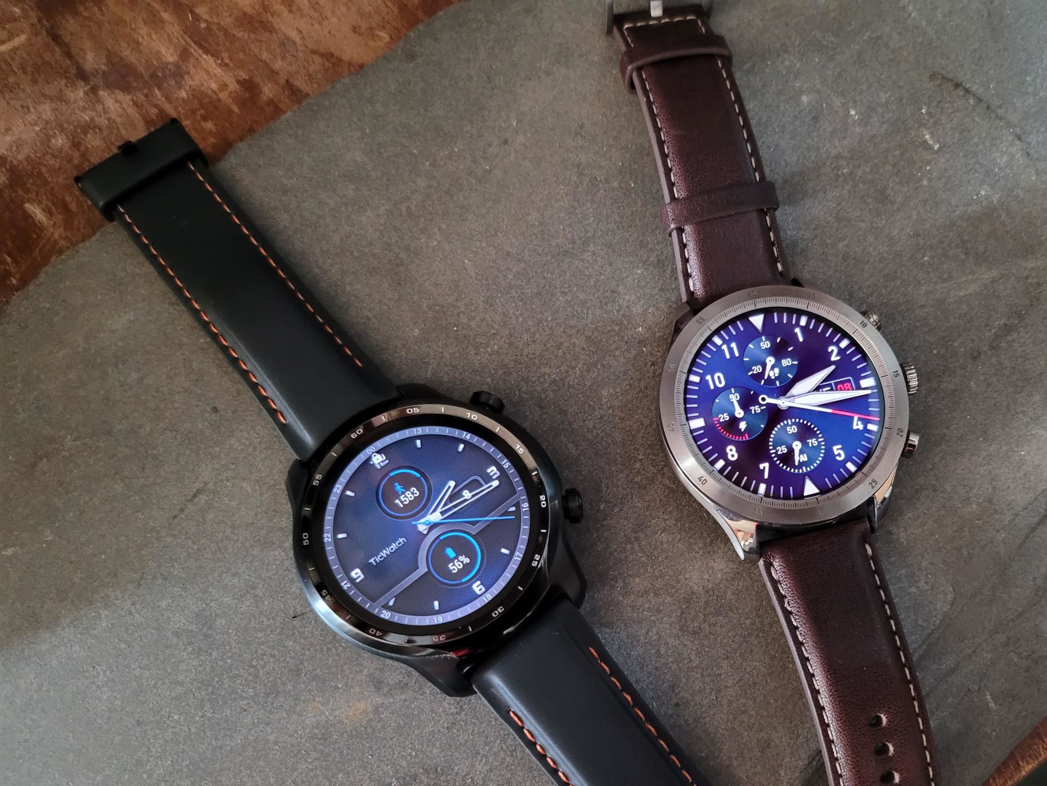
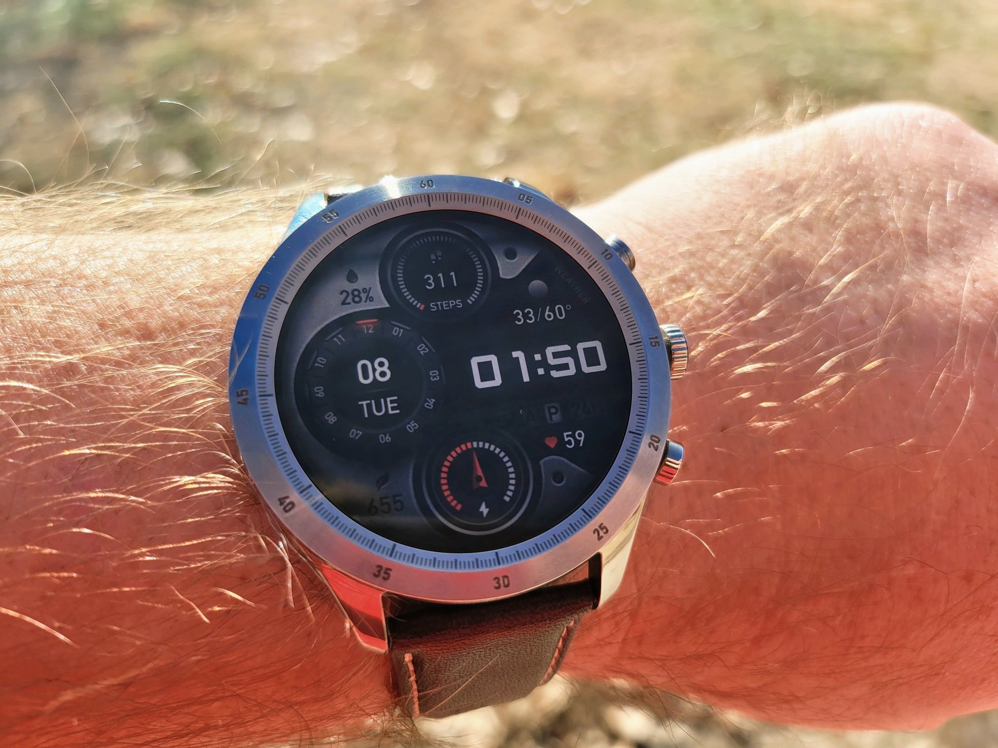
As I mentioned above, I use a TicWatch Pro 3 most days. It's my notification hub, sleep tracking, and health monitoring device that I have few complaints about. The Zepp Z has many parallels to my favorite watch in that it has a similar style and is full of sensors and software to help track your health. From the titanium alloy case to the rotating crown and the snappy performance to its broad software customization options, the Zepp Z is a device worth considering.
| Specs | Zepp Z |
|---|---|
| Dimensions | 45.9×45.9×10.75 mm 22 mm band |
| Weight | 40 g |
| Battery | 340 mAh |
| Materials | TC4 Titanium Alloy, PA + GF Bottom Case |
| Display | 1.39" AMOLED 454x454 326 PPI 550nits max |
| Colors | Silver |
| Memory | 16MB + 256MB |
| Water and Dust resistance | 5 ATM |
| Connectivity | Bluetooth 5.0 BLE |
| Sensors | BioTracker 2 PPG Geomagnetic Gyroscope Capacitive Air Pressure Accelerometer Ambient Light |
| Microphone | ✔ |
| Digital Assistant | Alexa (in a future update) Offline voice assistant |
| Location | GPS + GLONASS |
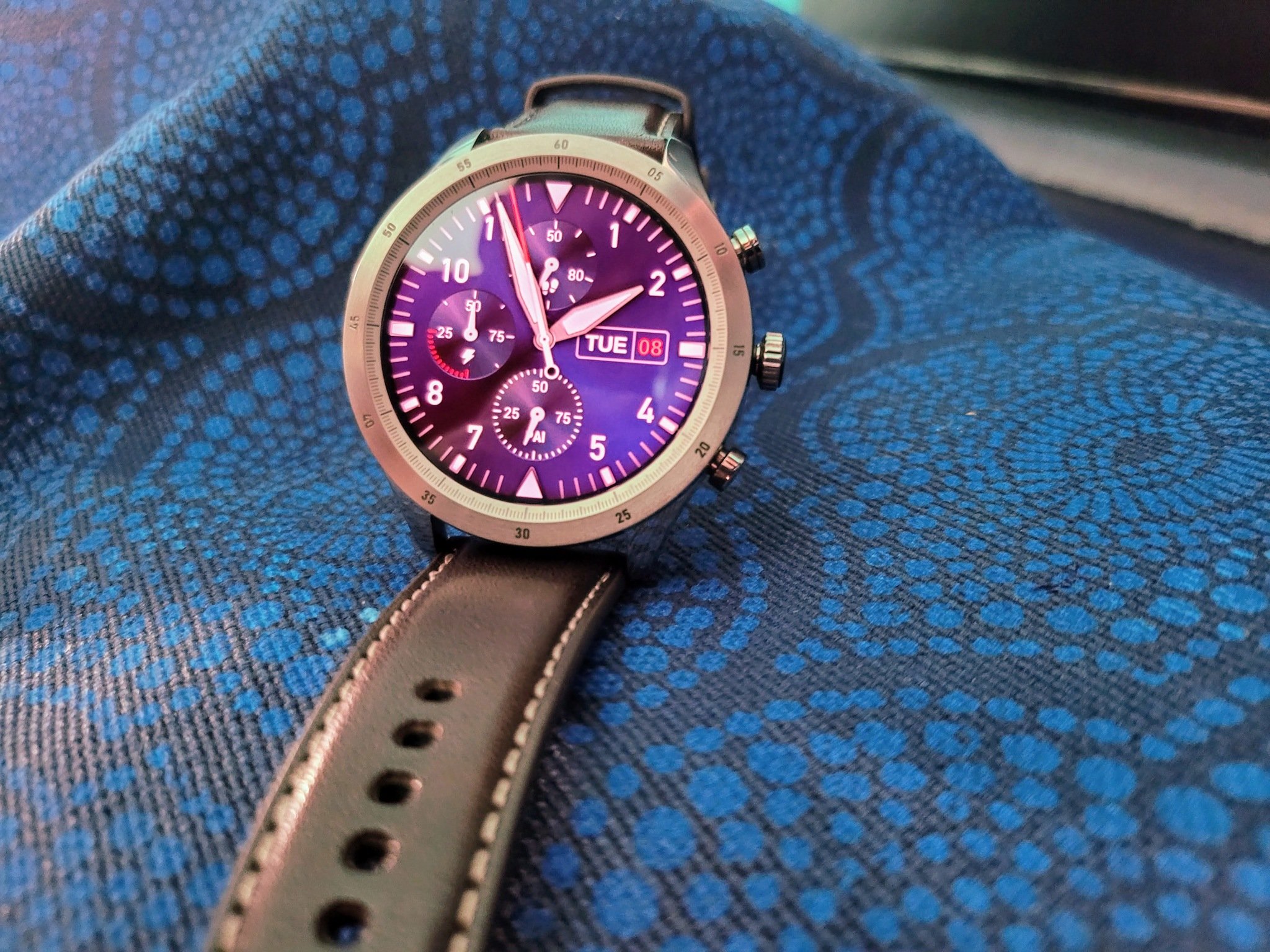
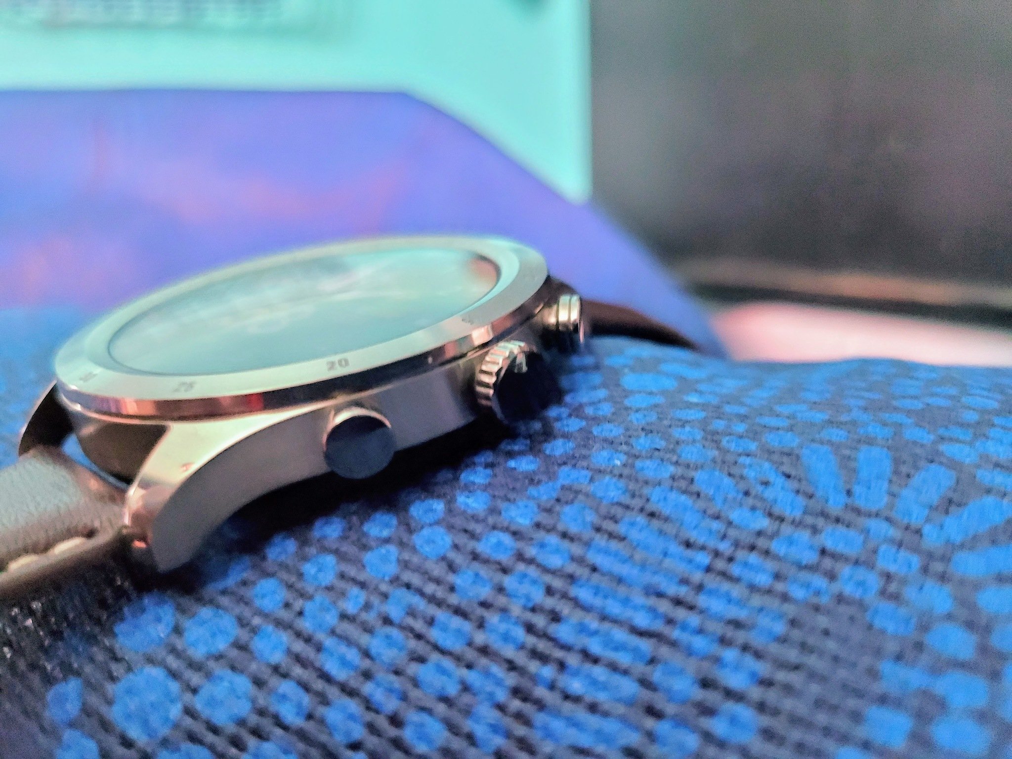
The Zepp Z is a relatively large device at about 46 mm, yet fairly thin at a mere 10.75 mm — thankfully, I have big wrists. Its large case size leads a lot of space for the Z's bright and colorful display at 1.39". I was pleasantly surprised when using the watch in direct sunlight that the screen was still visible. While the battery size inside the Zepp Z isn't the biggest around at 340 mAh, the very well-optimized software nets you excellent battery life.
While you can swipe around the screen to navigate on the Zepp Z, using the rotating crown is far better, especially with the sharp haptics.
Zepp says that with regular usage, you can expect up to 15 days between charges, and that's with many of the health monitoring, multiple workouts, and smart features enabled. However, I could only get between 5-6 days worth of use before I had to put the watch onto its wireless charger. While this is still great battery life for a full-featured smartwatch, it's not quite as advertised. Besides its appearance and fast performance, the rest of the Z is very different, primarily due to the software.
Much like Samsung and its Tizen OS, the Zepp has decided to forgo Google's Wear OS platform and use its own operating system on the Z. It's very responsive and quite features-rich, even if it doesn't have access to a third-party app ecosystem — more on that later. The navigation is set up much like Google's software where notifications are a swipe up, quick toggles are a swipe down, widgets are left, and Wear OS-like tiles are right.
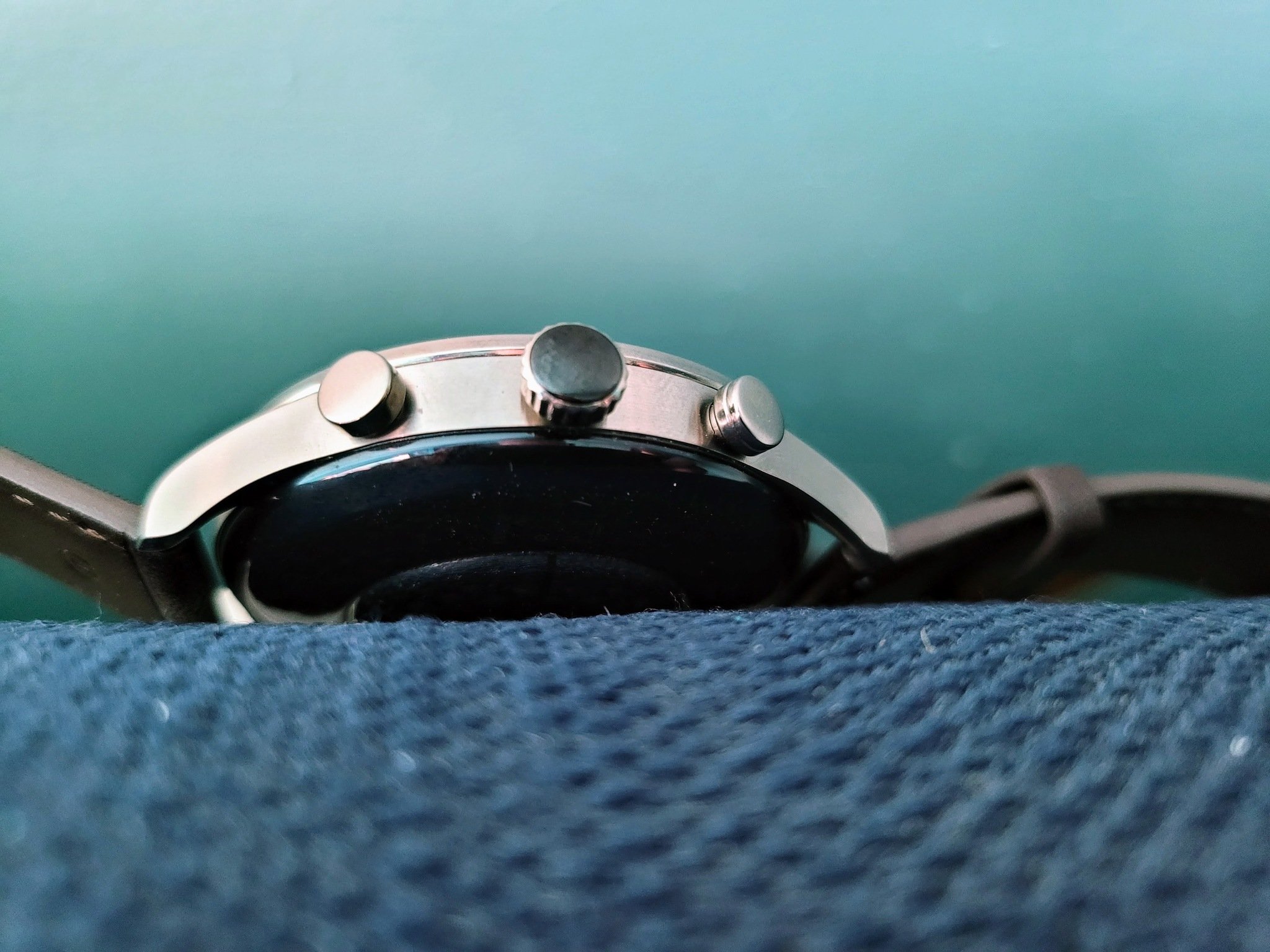
Unlike the TicWatch Pro 3, and many other smartwatches for that matter, the Zepp Z has three buttons on the side. The bottom button is customizable to act as a shortcut to an app on the watch. When pressed, the middle button will take you to the home screen, and if on the home screen, it will open the app drawer. This button also rotates to scroll and navigate the OS. At the top is the health key that doesn't actually move but can be set to manually get your heart rate, stress, or blood oxygen levels.
Onboard setting options for the watch aren't too extravagant and are kept relatively basic. However, when you head to the Zepp app, you get a whole lot of choice. The app acts as a hub for everything that the watch is tracking as well as the primary way for fully customizing the device. Though there isn't any app store, there is a watch face store accessible from the Zepp app with over 50 options to choose from. The Z has an onboard voice assistant that you can use to launch various apps or actions on the watch even when you're offline.
The Zepp Z will be getting Amazon Alexa integration in a future update but was unavailable at the time of my review.
From the app, you can customize so much of what your watch shows you, what it tracks, and how it reacts to various notifications. You can create custom vibration patterns for different types of notifications so you can know exactly what the source of that buzz on your wrist was without looking. Oh, and speaking of vibrations, the haptics on the Zepp Z are great. The motor feels very solid, and you definitely know when it activates.
One of my favorite software features of the Zepp Z is the ability to schedule when your display is always on and lift to wake. I know it may sound a bit silly for this to make me so happy, but it truly does. If you have ever worn a smartwatch for sleep tracking, you know how annoying the display can be. Yes, most watches have a setting to disable the screen, but it requires manual action on your part. Being able to tell the watch to turn off the display between certain hours automatically is lovely.
One of the big focuses for the Zepp Z is its health and well-being features. At the core of this feature is the PAI Health Assessment System. PAI takes all of the health data that the Zepp Z monitors and gives you a single score to help you easily see how you're doing. Of course, if you want a more expensive breakdown of the data that got you to that score, it's available as well.
The Z can track blood oxygen levels, heart rate, stress levels, steps, and sleep, each with deeper levels of information to dive into. Because it can monitor all of these health metrics, the Zepp Z is also a solid fitness tracker as well. There are 12 workout modes built-in with indoor and outdoor running and cycling, elliptical, skiing, and more. Also, since the Z is 5 ATM water-resistant, you get two different swim modes included.
Workouts have competitors on the left and Zepp on the right, sleep has Zepp on the left.
During my testing period, I decided to wear two watches (one on the right and the other on the left) for a couple of my workouts. By no means is this scientific, but just a rough comparison. One day I wore the Zepp Z and Samsung Galaxy Active 2, and another day the Z and TicWatch Pro 3 to see how different the results were. For some reason, though, my TicWatch didn't sync my data with Google Fit for that day, so I don't have the lifting portion of that day. Looking at the comparisons, there are some notable differences, mainly in the heart rate and pace calculations.
Zepp Z: What I don't like
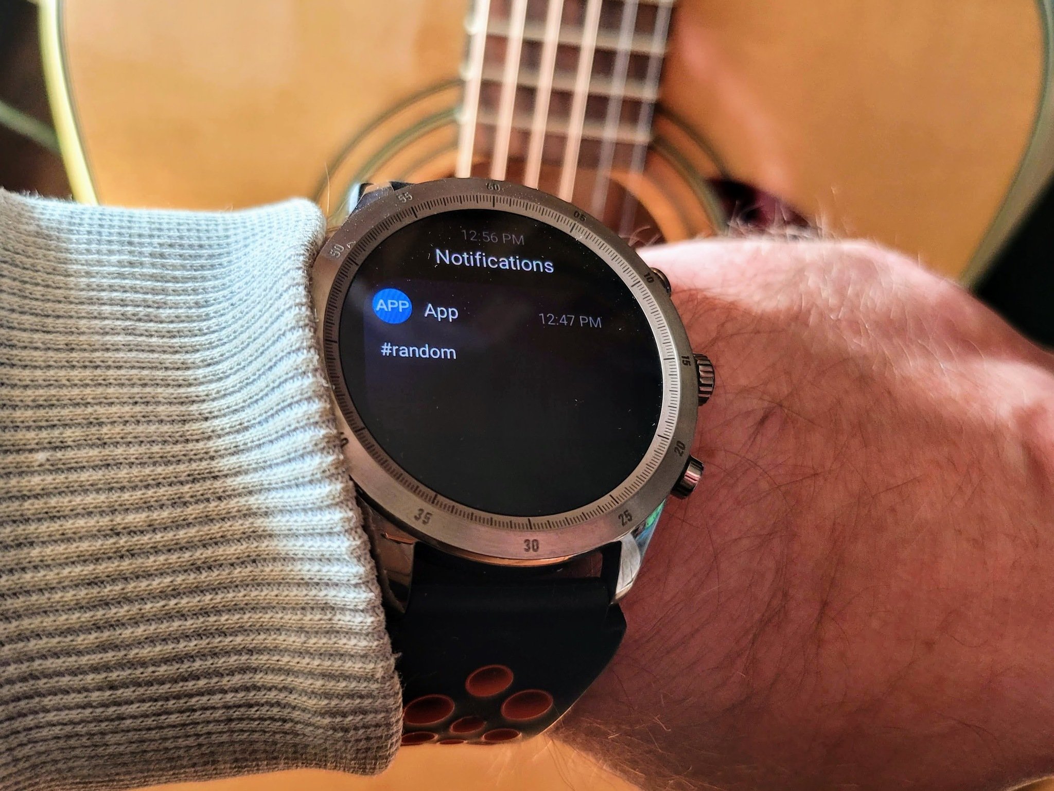
For all that the Zepp Z has going for it, there are some downsides as well. One of the most frustrating to me is how the notifications are handled. You can choose what app notifications you would like for the watch to display from within the Zepp app. However, when your wrist buzzes, the watch doesn't tell you what app it came from — it merely says app.
Aside from not knowing what app just sent you the notification, you can't do anything with it other than dismiss it. No replying to a message even though there's a microphone, and you can't expand the message either, at least not initially. So if you get a pop-up from WhatsApp, Telegram, Google Messages, or anything else, it isn't easy to know where the message is coming from.
The watch's overall look is nice with its three hardware buttons, but the top button is a strange one. I say this because when I took the Zepp Z out of the box, I actually laughed out loud because I thought it was a fake button there just for looks. After all, it doesn't physically move. It wasn't until I started to set up the device that I learned it was the health key.
For all of the Zepp Z's health and fitness aspirations, it seems strange to leave out the ability to take an ECG reading.
While I like the idea of manually activating a health reading at the touch of a button, that doesn't help me if it doesn't work. Ok, it works, just not all the time. You have to be on the home screen and then press/touch the button to start the reading you assigned to the key. However, getting the task to initiate is very inconsistent and may work better if it was a pressable button.
The only other thing that really is missing from this watch is the lack of third-party apps. Now the watch will sync your health data with Google Fit, Strava, WeChat, or Relive if you want — but that's it for outside of Zepp. Now, personally, I don't need many apps for my watch, but I would like to use my favorite music player or maps. There's also a handful of utility apps that I use on Wear OS that would be handy as well.
The competition
There aren't many watches vying for your wrist at this price range, but one that is worth looking at is the TicWatch Pro 3. This watch runs Google's Wear OS for its main software, with TicWatch putting some of its custom options on also. Because this is part of the Wear OS ecosystem, you'll have plenty of apps to use on your watch as well. You'll find many of the same health and fitness features like built-in workout modes and sleep detection and SpO2 tracking but also get automatic workout detection too.
Though the TicWatch Pro 3 doesn't have quite as long battery life as the Zepp Z, you will get 3-4 days of use, and in the essential mode, you can get up to 45 days. This is due to the dual-layer display technology that offers exceptional direct light visibility.
The other big competitor in this range is the Samsung Galaxy Watch 3. On this watch, you have Samsung's Tizen software running the show, and while it doesn't have quite as extensive of an app ecosystem as Wear OS, it at least has third-party apps. The Galaxy Watch 3 is a beautiful piece of hardware, and it utilizes a physically rotating bezel for navigation in place of a rotating crown that the Zepp Z uses.
Something that you get with the Galaxy Watch 3 that you don't with the TicWatch Pro 3 or the Zepp Z is choice in hardware. You have two sizes and three colors, not to mention an option to get LTE on the watch too.
Samsung also focuses on health and fitness on its watch with everything that the Zepp Z can do and more. With the Galaxy Watch 3, you also get ECG reading, automatic workout detection, workout coaching, and VO2 Max readings.
Zepp Z: Should you buy it?
Who it's for ...
- If you want a well-built watch with a classic look
- If you want a watch that can get you a week of use before charging
- If you want to be able to customize a lot of how the watch works
- If you want a watch that has a good health and well-being ecosystem
Who it's not for ...
- If you want to know where a notification came from
- If you want to be able to take action on a notification
- If you want to be able to have some of your favorite apps on your watch
- If you want to take ECG readings with your watch
So much of the Zepp Z is really well done, from its hardware and battery life to its responsive software and health features. Unfortunately, some of its biggest downfalls are in its software as well. Because it's not part of a bigger ecosystem, you miss out on apps like mapping, Spotify, or other utilities that can be helpful on a watch. This is also the reason that notifications on the Zepp Z are barely worth having.
Overall the Zepp Z is a very polished device in how it operates and the hardware itself. The use of lightweight, durable materials helps to offset the watch's large footprint — err wristprint? It's been a long time since I've gotten to use a watch with a rotating crown, and though it isn't a necessity, this is a great feature for getting around in the software.
That being said, I don't see the Zepp Z pulling me away from my TicWatch Pro 3. The Z's mishandling of notifications and lack of key third-party apps is a big downer for me. For the most part, I really like what Zepp has done in the software department, but the features that are lacking are significant — especially at this price.
Zepp Z
Bottom line: This titanium encased smartwatch is as classy looking as it is smart. Full of health and well-being features, you'll look great both on a jog and in the office.
0 Response to "You Can See More: Zepp Z review: An excellent watch hampered by two software flaws"
Post a Comment