Samsung finally made a phone I want to use.
Samsung phones and I usually go together as well as oil and water. Galaxy S and Note devices stand out as some of the biggest Android releases of the year, not to mention Samsung is one of the largest tech brands on the planet. It's no secret that a lot of people like the company's gadgets, but try as I might, I just haven't been able to get excited about Samsung's Android phones over the last few years.
Whether it be Samsung's heavy-handed software customization, tired designs, or good but not amazing camera systems, I always find myself drifting to another Android (lately my Pixel 4 XL) even when I have a Galaxy at my disposal. This happened for the Galaxy S10 and the Note 10 back-to-back, so when given the opportunity to review the Note 20 Ultra, I wasn't immediately optimistic.
I've now had the Note 20 Ultra as my daily driver for a little over a week, and during that time, I've come to a conclusion that I didn't anticipate. Not all of my qualms with Samsung are addressed with this phone, but it's easily one of my favorite devices of the year — and it has me excited for Galaxy releases once again.
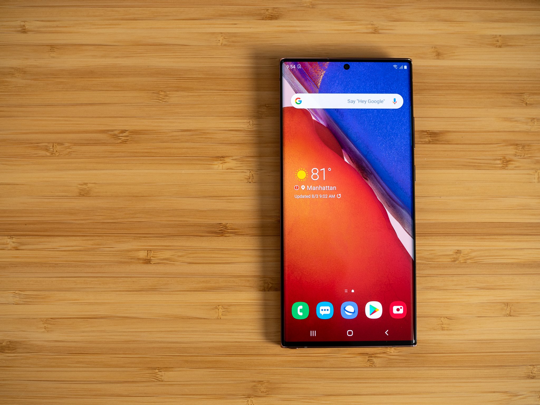
It all starts with that display, which is (obviously) one of the best you'll find on any smartphone. You get the usual Samsung goodies of a vibrant AMOLED panel and slim bezels, and just like the Galaxy S20 before it, the Note 20 Ultra boasts a buttery smooth 120Hz refresh rate. I tried playing around with the Note 10+ before my Note 20 Ultra arrived, and as much as I like certain things about that phone, Samsung's software with a 60Hz panel just feels bad to me. I can use an iPhone 11 Pro with a 60Hz screen just fine, but something about the way One UI moves/feels on that lower refresh rate is Not It.
Samsung phones always feel slow to me, but the 120Hz panel completely fixes that.
Now that I have a Galaxy phone that doesn't feel like it's constantly lagging, I'm able to just use and appreciate it for what it is. I'm still not the biggest fan of everything Samsung does with One UI, but with Lawnchair as my default launcher and that 120Hz making everything run like butter, my Note 20 Ultra performs a lot like a Pixel that Google could only ever dream of making.
Speaking of Pixels, I've been seriously impressed with the Note 20 Ultra's cameras. I never got a chance to mess around with the S20, but I've heard enough horror stories from colleagues about focusing issues from the S20 Ultra that I never felt like I was missing out on much. In my time with the Note, it's performed every bit as good as I could have hoped for. It has zero issues focusing on subjects, the periscope sensor allows for incredibly fun zoom shots, and night mode is far better than I was anticipating. It falls into the camp of one of those phones you can whip out, take a picture, and know you'll get a great shot. When you pair that reliability with the additional lenses and Samsung's endless settings/features, the end result is a camera package that I'm regularly excited to play around with.
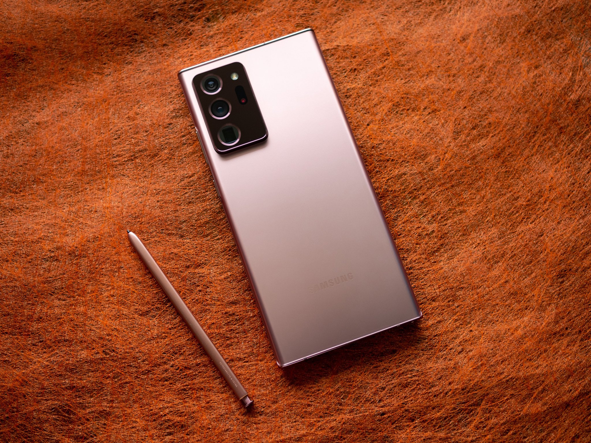
Then there's the design. Say what you will about the large camera bump or the pink-ish Mystic Bronze color, this is the best-looking phone Samsung has ever made. The matte glass looks and feels outstanding, fingerprints are kept to a minimum, and the overall attention-to-detail is unmatched.
Yes, the camera housing is big, but it's also one of the nicest-looking ones I've ever seen. The darker bronze color contrasts beautifully with the rest of the phone's body, and even something as small as the colored accents around each lens makes it feel like a thoughtful design decision rather than a slapped-on afterthought. Combine that with the flat edges and wonderfully clicky buttons, and it's easy to see that a lot of thought and detail went into designing the Note 20 Ultra.
With that praise out of the way, I fully recognize and understand the criticism surrounding the Note. $1,300 is a lot of money to spend on a smartphone during any time period, but especially so given the financial constraints so many people are feeling right now. If the Note 20 Ultra is out of your budget, that's absolutely fine. If you want a barebones Android phone that does everything really well for considerably less money, just buy the Pixel 4a and call it a day.
If you are financially able to get a high-end Android, however, it's honestly hard for me to think of anything better than the Note 20 Ultra. And again, I'm saying that as someone who typically ignores these phones year after year. Samsung does so much right with its devices, and now that I have a smooth-as-can-be display, fully reliable cameras, and a design I'm actually excited about, I can finally appreciate all of those high points now that most of my biggest issues have been addressed.
I'd still love to see One UI scaled back a bit and Samsung sunset its duplicate apps, but for the first time in a long time, I can't wait to rock a Galaxy as my daily driver.
Ultra Note
Samsung Galaxy Note 20 Ultra
From $1,300 at Amazon From $1,300 at Best Buy From $1,300 at B&H
One of the most premium and capable phones of 2020
It's been a lot time since I've had a Samsung phone that I legitimately liked using, but the Galaxy Note 20 Ultra changed that. Just about everything the phone does is handled exceptionally well, whether it be the gorgeous design, 120Hz display, or outstanding cameras. Whether or not it's worth $1,300 is up for you to decide, but regardless, it stands out as my favorite Galaxy handset in a long time.


0 Response to "You Can See More: The Note 20 Ultra is the first Samsung phone I've liked in years"
Post a Comment