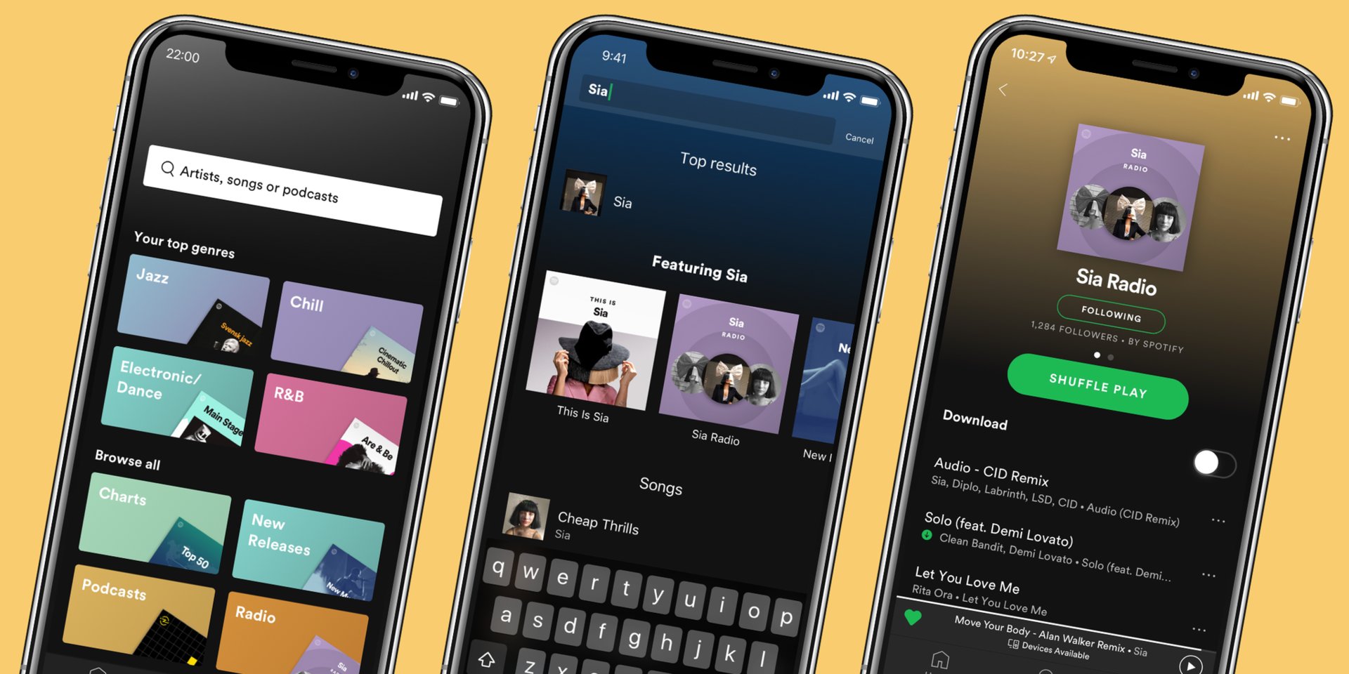
The Search page is also more powerful.
Way back in August of this year, Spotify rolled out a new UI for its Android app that's much simpler and easy to use. This was a very welcome change considering how cluttered the app used to be, but up until now, this new UI has only been available for free users. Now, Spotify's expanding this to its Premium subscribers.
The bottom navigation bar that used to have tabs for Home, Browse, Search, Radio, and Your Library has been cut back to just Home, Search, and Your Library. The Search page has been completely revamped and is now your one-stop shop for finding all sorts of new music. At the top of the page is a "Your top genres" section that'll change over time based on your current listening habits.
Also new are revamped Artist Radios. Spotify says that these now "offer an endless listening stream personalized to the listener's own musical tastes." Artists Radios are "updated regularly to keep things fresh", and if you want to take them with you wherever you go, you now have the option of saving them for offline use.
All of this is rolling out to Spotify Premium users for Android and iOS starting today, so keep an eye out for it!

0 Response to "You Can See More: Spotify update brings simpler navigation + offline radio to Premium users"
Post a Comment