DeX has come a long way, but there's still some work to be done.
When Samsung DeX debuted in early 2017 it was… not great. The idea had been tried by Microsoft and Motorola before them, and it sounds good on paper: you already own a phone, so why not expand it into a desktop to be more productive?
Again, that sounds great on paper, but it's a wildly different experience when the rubber meets the road. Or in this case, when the phone meets the dock. I've been playing with DeX for the last few weeks in the ramp up to the Galaxy Note 9's announcement, so it's time to see how DeX has grown in the last year and a half.
- What hasn't changed
- What's better
- What still needs work
- Compared to other platforms
- Is DeX good enough to replace a standalone computer?
What hasn't changed
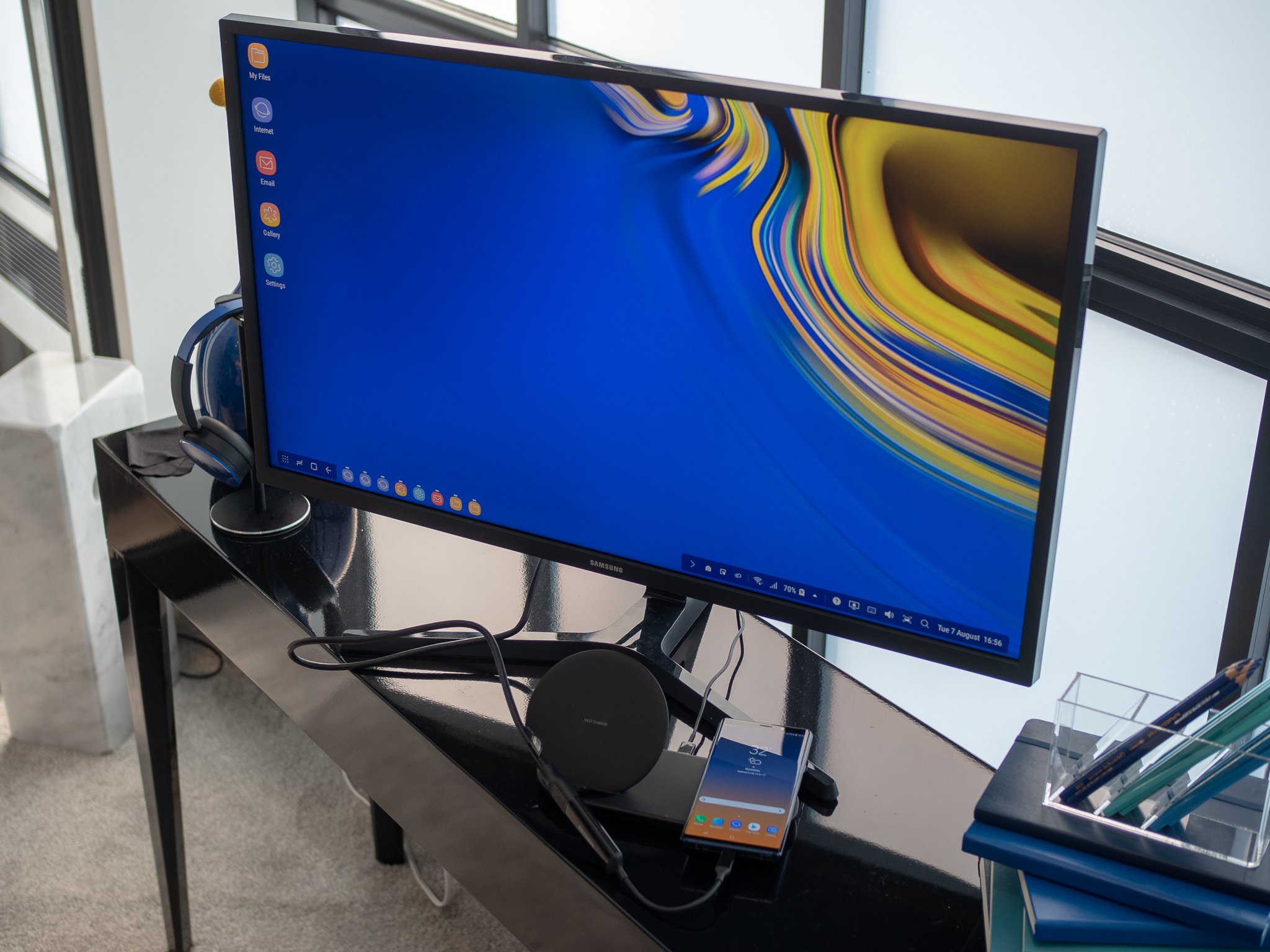
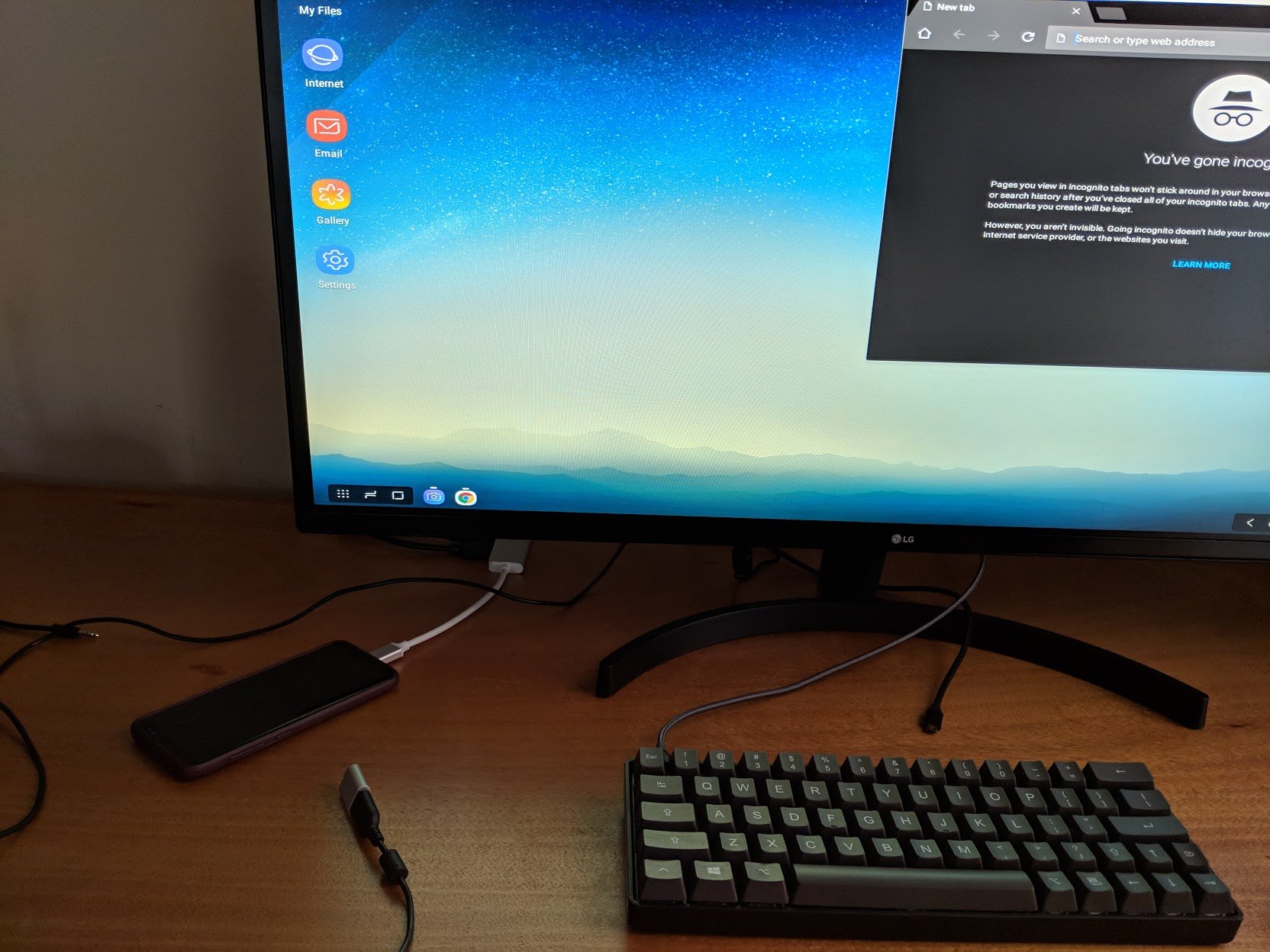
The interface looks mostly the same as it did in Spring 2017, and that's perfectly fine. The DeX desktop interface takes a few design cues from Windows 10 and Chrome OS: there's an app list button in the lower left, a taskbar with icons for your active apps along the bottom center, and status icons and quick toggles in the lower right. You also get a proper desktop where you can place app icons, or you can pin them to the taskbar. It's not a carbon copy of Windows or Chrome, but DeX follows the same design conventions close enough to make it so anyone can start using DeX without trouble.
The interaction with apps hasn't really changed either. Apps can either be in portrait or landscape, and are the same size and layout as they would be on your phone in those orientations. It's still not a replacement for a laptop, but then again Samsung isn't selling a laptop-like dock for this.
What's better
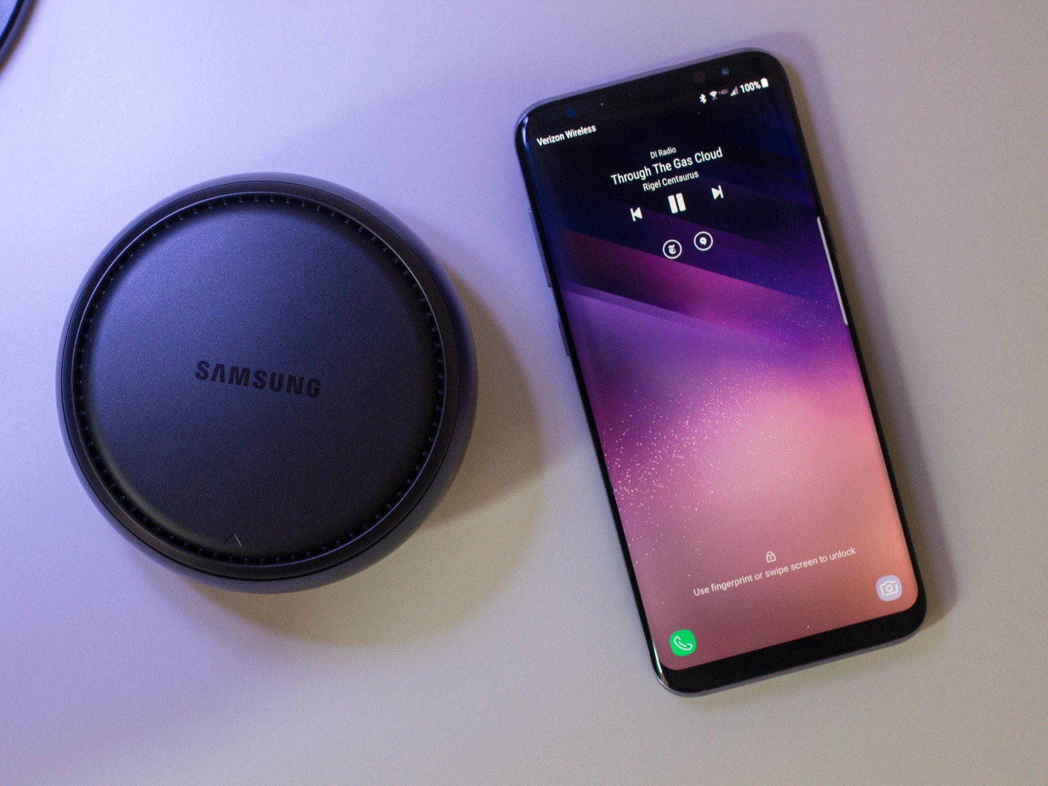
DeX's biggest strength now comes from the hardware it ships on. The Note 9 and Galaxy S9+ come with 6GB of RAM, 2GB more than came on the Galaxy S8 that DeX launched alongside. The extra RAM is crucial to keeping the interface smooth, and keeping more apps up at once. Using DeX on my Galaxy S8 still leads to some apps force closing as I try to open more apps up, and extra RAM and newer processors make for a much better experience.
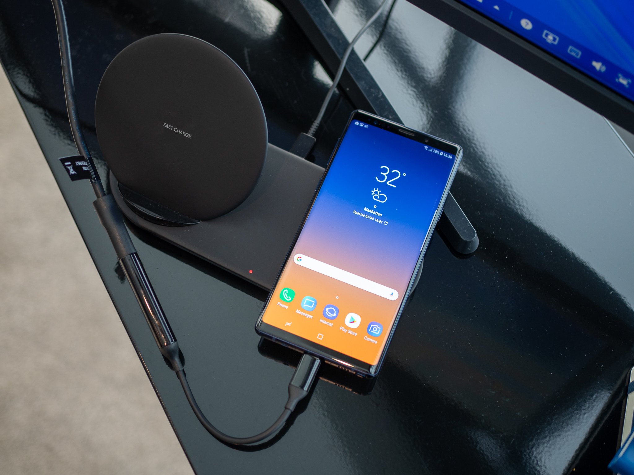
You also need a smaller monetary investment to use DeX. You still need a Galaxy flagship from the last two years, but the S8 are cheaper than ever while still being great phones. With the Note 9, you can use DeX from almost any USB-C hub — you can unofficially do this with other phones too — if you don't want to spend extra money on a DeX dock. If you do want the dock, it goes on sale regularly. As for other accessories, you still need a separate monitor, but you can use the Note 9's software keyboard or touchscreen if you don't want to pony up for desktop accessories.
Galaxy Tab S4 users have it even easier: DeX is built right into the tablet's software. You can change between the two modes at any time, even when the tablet isn't docked into its Book Cover keyboard case, but it's better with a keyboard and mouse.
What still needs work
The biggest limitation from DeX's launch is still around: the apps. These are still mobile apps, and while companies like Adobe and Microsoft have put effort into making their services great on DeX, that's definitely not true of all apps. There are other limitations too: you can only have one Google Doc, Slide or Sheet open at once, since that's what's expected of those applications on a smartphone. Chrome works well enough, including common shortcuts like Ctrl + Shift + N to open an incognito window. But there aren't any Chrome plugins or apps, so your favorite ad blocker isn't available.
This situation isn't in Samsung's control since it requires effort from app developers, but it's definitely to the detriment of the DeX experience. Samsung makes the most popular phones that run Android, so hopefully they keep investing in DeX and application developers put the work in for their apps.
Compared to other platforms
Windows and macOS have been around since dinosaurs roamed the earth, and every piece of software you may need is likely to be on either of these operating systems. Chrome OS is newer, but with a full desktop browser and Android applications that know they're on a larger screen you can do almost anything.
DeX is much more limited than any of these other platforms. Apps look and behave just they would on any other smartphone, but the app window can't be used across your entire monitor. Chrome and other browsers have their mobile interfaces, which are much more constrained than the desktop equivalents. You'll be more limited using DeX than you would another operating system.
Is DeX good enough to replace a standalone computer?
One constant since Spring 2017 is a complex question: who is DeX actually for? Laptops and desktops are common enough to be a commodity, and it makes little sense to replace a perfectly good machine with a DeX dock that will leave you less productive. For heavy mobile users, a macOS, Windows or Chrome laptop is going to worlds better than trying to find a monitor for your DeX dock.
But let's say you already do 95% of what you need to on your phone. You may already have an old desktop, monitor, keyboard and mouse that have been in your house for years. You don't really need the desktop anymore, it's just there because it's always been there. You may consider DeX because you don't use that desktop enough for your productivity to suffer from moving to DeX. The limitations listed above don't apply to you because of the way you use your computer, and that's okay.
Or, you could be a corporation that issues Galaxy phones to your workforce. Again, a vast majority of their work is done on the go. But again, you likely have a stock of monitors, keyboards and mice. It's not that much more of an investment to set up a few DeX stations for those workers to type up longer emails and documents. If you just want a bigger screen for the things you do on your phone, DeX makes a lot of sense.
What say you?
Do you still use DeX in 2018? What's better, and what still frustrates you? Let us know down below!


0 Response to "You Can See More: Samsung DeX review, 2018 edition: More productive, but still problematic"
Post a Comment