Google Assistant may be bigger and better than Samsung Bixby, but that doesn't mean there's nothing Google could learn from it.
Bixby isn't all bad. There, I said it.
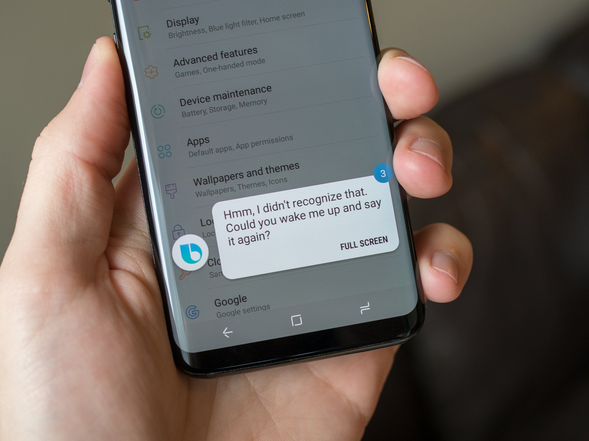
Samsung's take on the AI assistant has been widely panned since it debuted back on the Samsung Galaxy S8, and few things have been more hated on the last few Samsung flagships than Samsung Bixby and it's dedicated and mostly useless Bixby button — which you can't disable on the Galaxy Note 9. Sure, Bixby's rollout was slow, its functions aren't as consistent or as all-encompassing as Google Assistant, and since Bixby is limited to Samsung devices, it can't be used in nearly as many places. But that doesn't mean Bixby is worthless.
There are a few valuable lessons and features that bigger, better AIs like Google Assistant and Amazon Alexa could stand to learn from the little button that can't.
Give Assistant a makeover
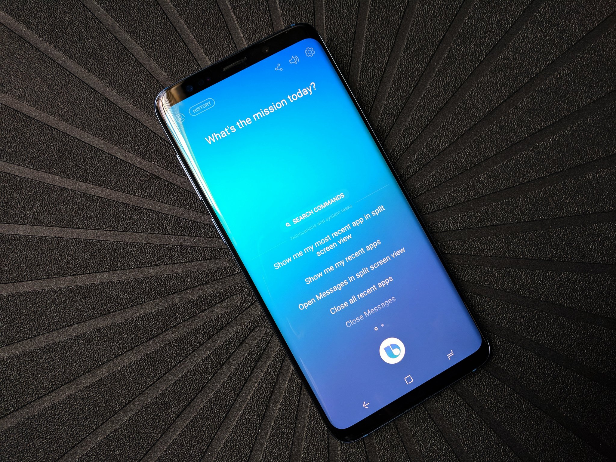
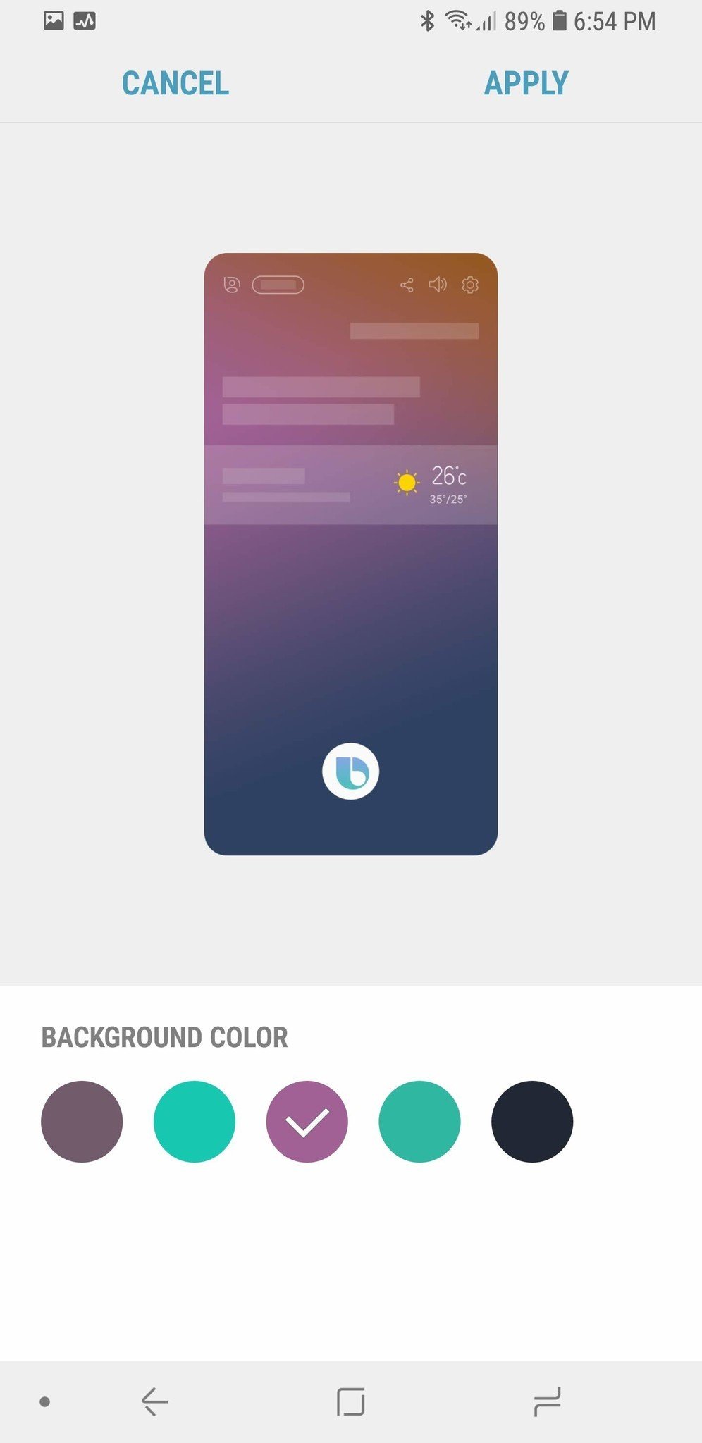
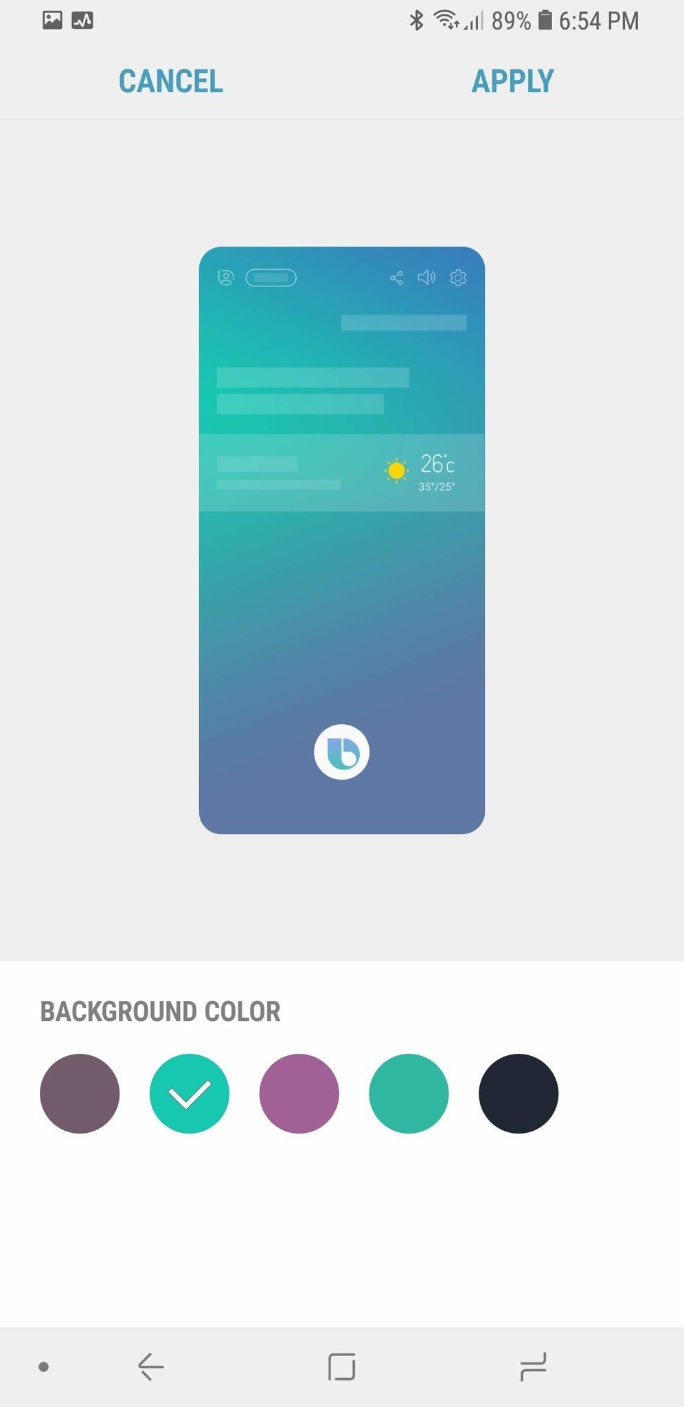
I've said it before and I'll say it again: dark themes should be the norm, not the exception on Android, and while manufacturers have been giving us dark themes more readily than Google the last 5 years, no one has done quite so many and quite so easily as Samsung. Galaxy Themes allow users to dye many Samsung apps black, and while those these don't quite extend to Bixby, that's okay. Bixby lets you choose from one of five background color themes that are used for Bixby's voice popups and full-page dialogs.
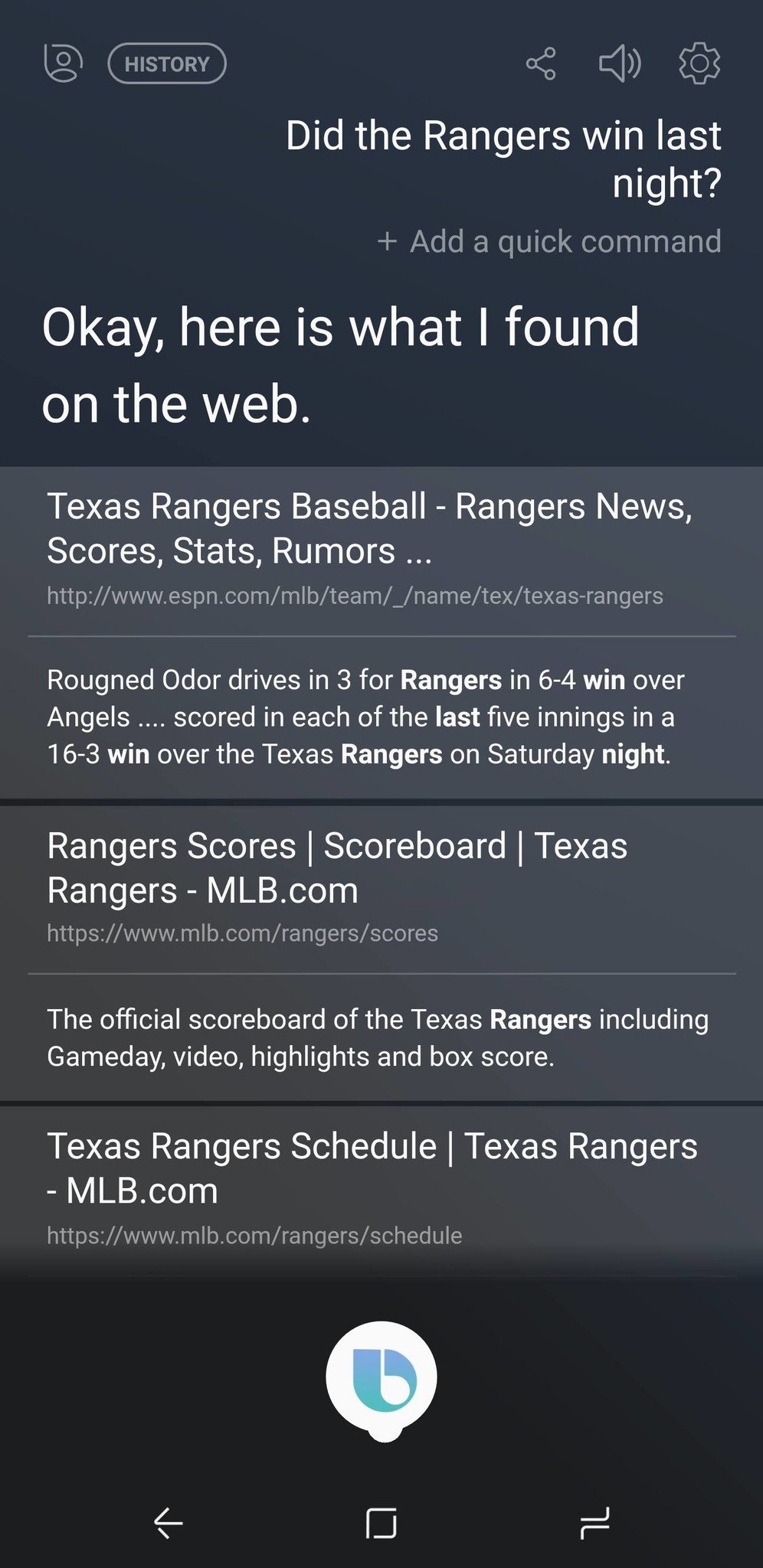
The options available to users are somewhat repetitive — two are teal-based and two are purple-based — but the ability to give Bixby a darker look means it won't blind you when it randomly wakes up in the middle of the night the way Assistant's blinding white will. Changing the color of the Bixby prompt is a bit like changing the wallpaper on your phone: it's not hard to do, and it makes the phone feel more personal.
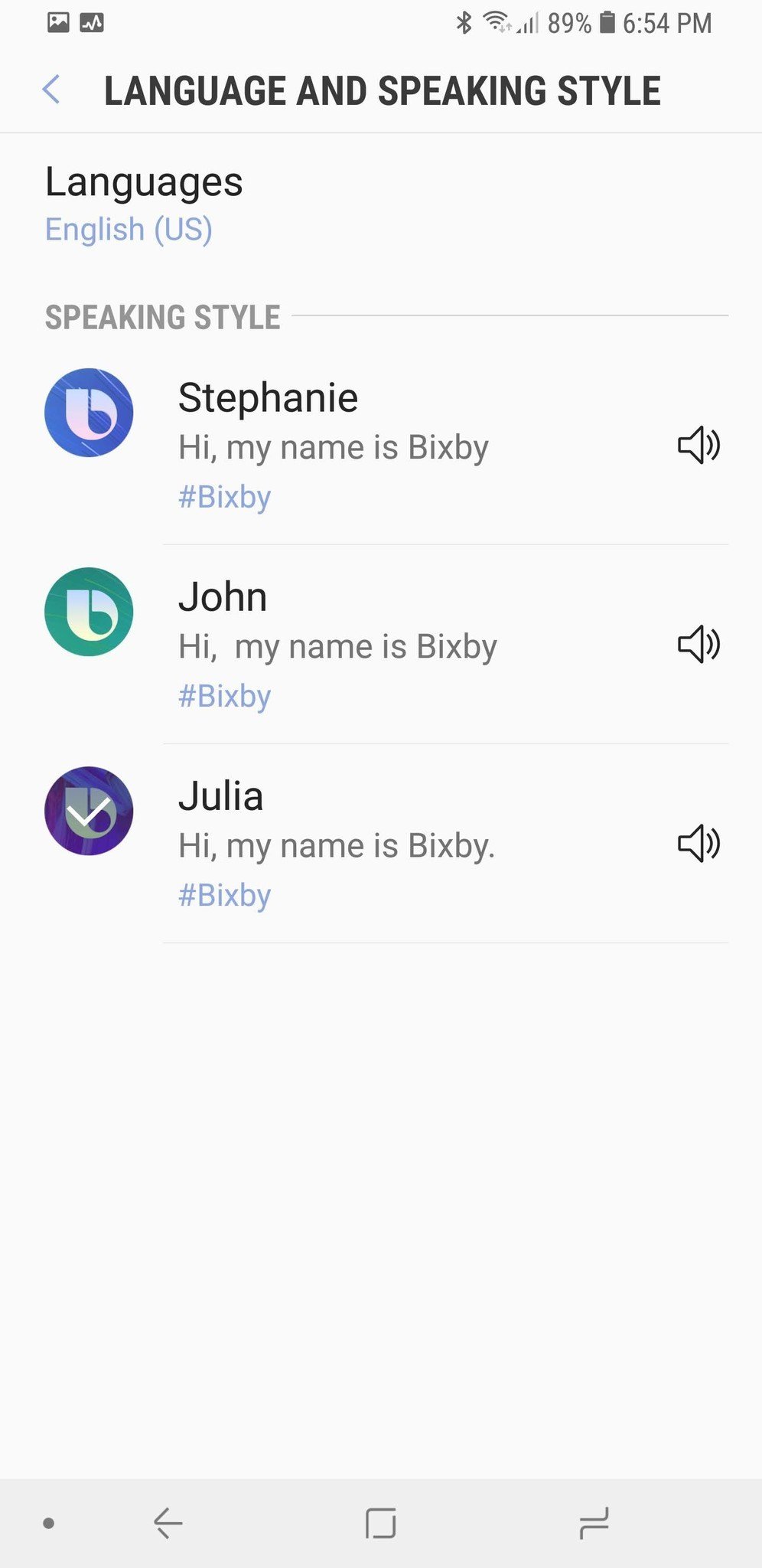
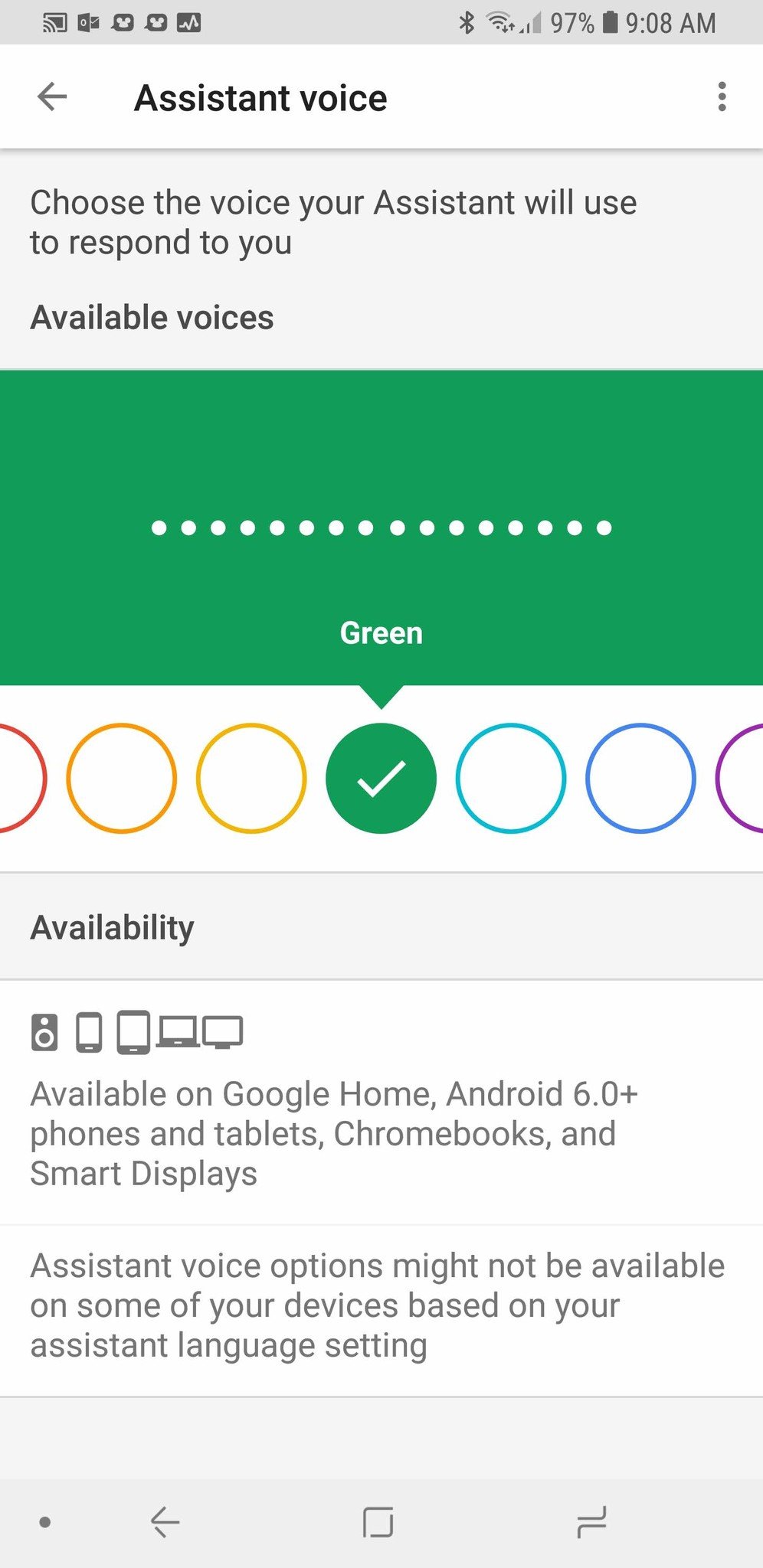
Speaking of personalization, Bixby gives each of its three voices a distinct, human name, which in turn helps the choices feel more human and more casual for users who are supposed to carry on conversations and build trust with Bixby. Google Assistant's voices have upgraded from Voices 1-8, but instead of human names, we have color names with no voice personality descriptions. Is Red more aggressive? Is Amber bright and cheerful like her color? The voice of a personal assistant needs to be personable; it needs personality and empathy for people to trust it more.
Upping your game
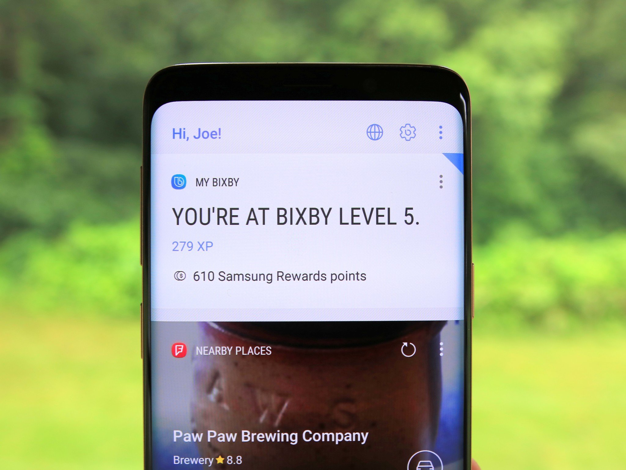
The problem with Bixby's themes was that at Bixby's debut, most of the good and dark themes were locked until you hit a certain level with your Bixby Points. Up until a few weeks ago, you got points for using Bixby, points that could be used to climb the leaderboards or redeemed for gift cards. More points were given when you used new commands or features, and if Bixby got something wrong, you could get extra points correcting what it misheard and/or telling it what you actually wanted it to do.
This isn't an unheard of tactic: Tasker's AutoApps plugins have used Google Play Games in the past to gamify their not-insignificant learning curves. Tying Google Assistant into Google Play Games and displaying achievements and leaderboards could encourage users to explore all the cool things Google Assistant can do. Sharing these achievements socially could also increase the visibility of what Assistant can do organically.
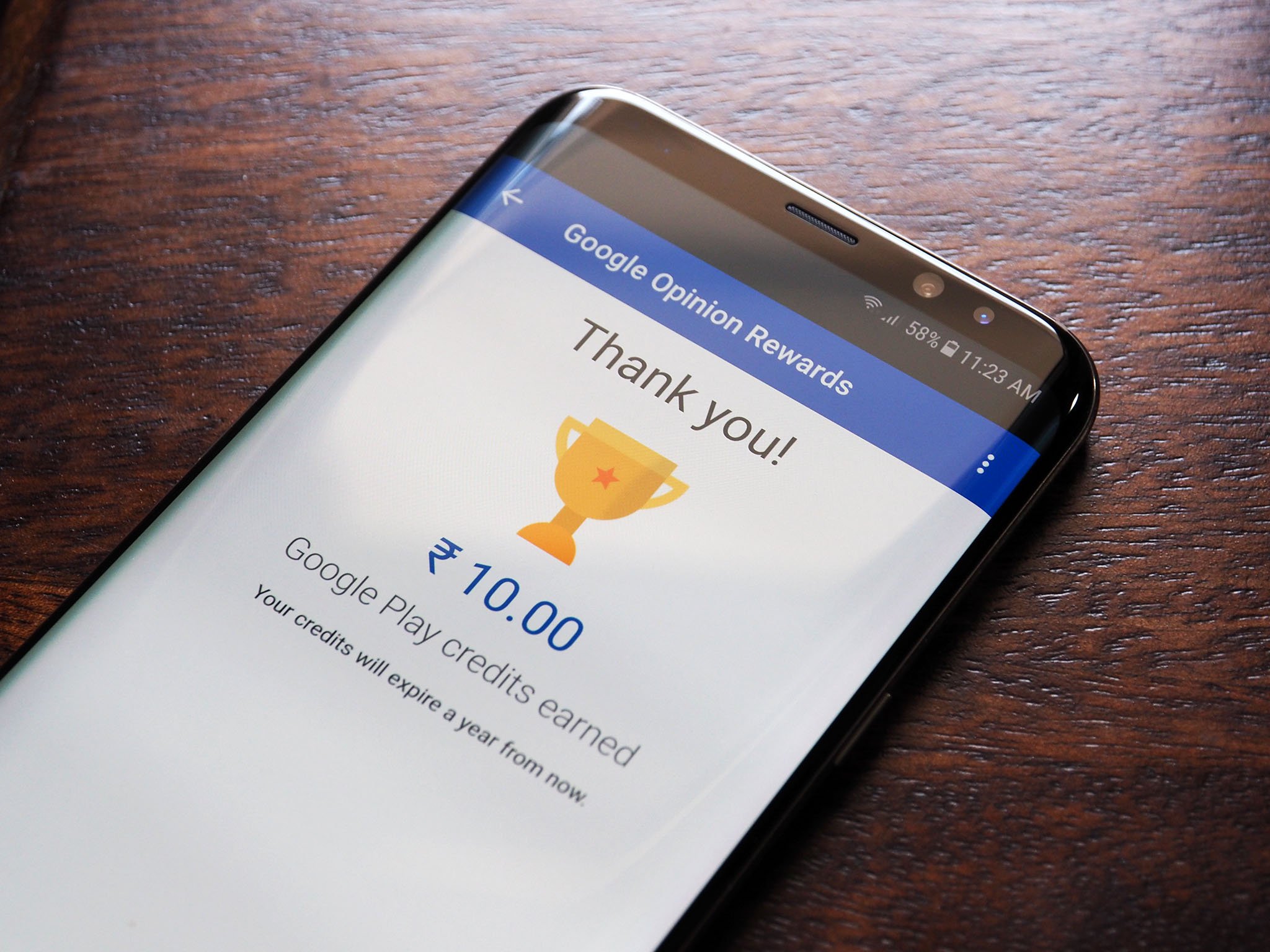
Even more than leaderboards, though, Google giving users Google Play credit for correcting a wrong answer or clarifying a misheard commands could also help Google's AI learn even faster. These kinds of surveys already pop up in Google Opinion Rewards from time to time, but allowing it all to be handled within the Google Assistant app could increase the user pool Google gets feedback from — after all, Google Opinion Rewards is free money but not widely known. It would also encourage users to test Assistant's limits more often in hopes of unlocking more credit for a new app or TV episode.
Touch me, touch me
When Bixby first arrived, there was something it could do that Google Assistant could not — interact with your screen as if you were tapping it. If you asked Bixby to "Open YouTube and Show me all the channels I've subscribed to," it would open the YouTube app to the Subscriptions tab, and then tap the ALL option in the channel carousel. This kind of multi-step action would have been invaluable, if only it had consistently worked with most apps. As it was, Bixby's complex actions like these didn't always work with the apps that were supported, and not a lot of apps were supported to begin with.
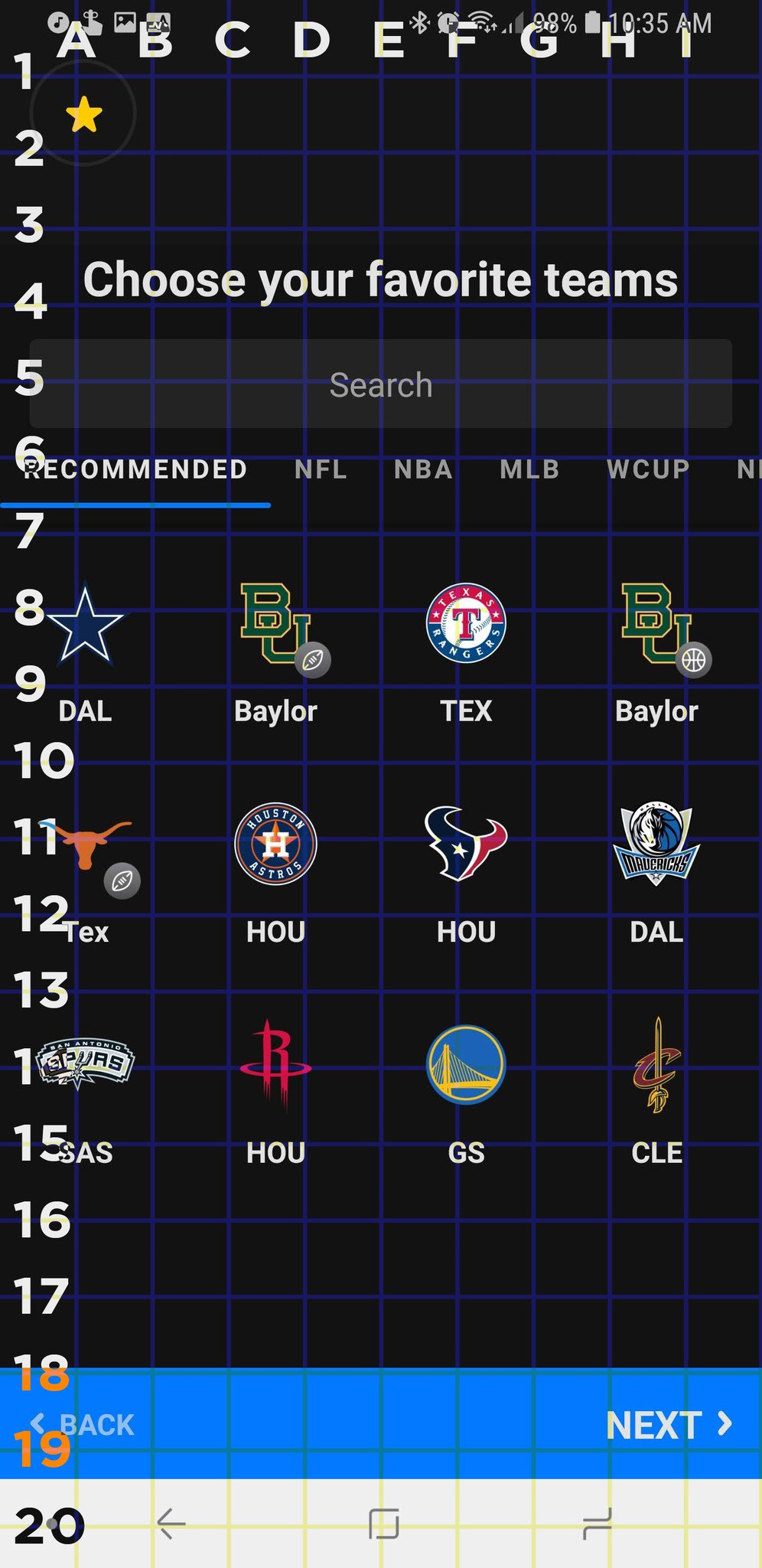
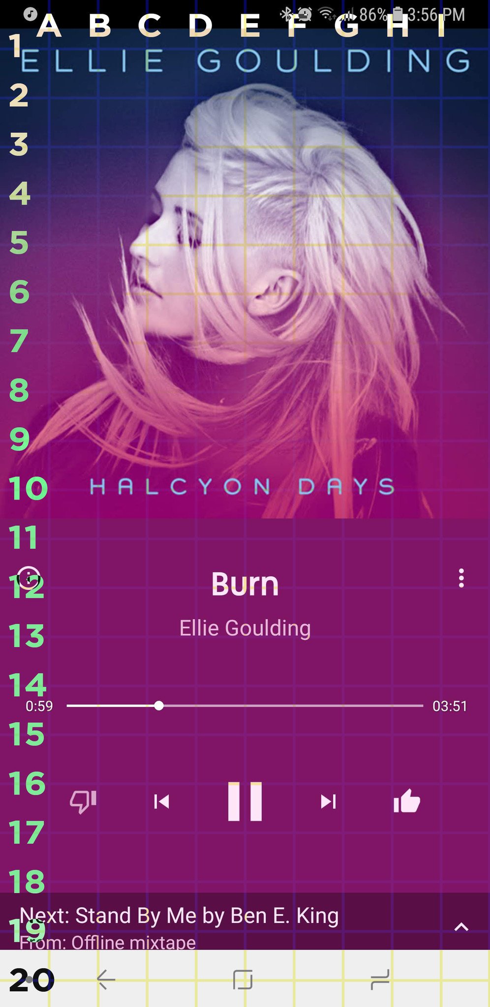
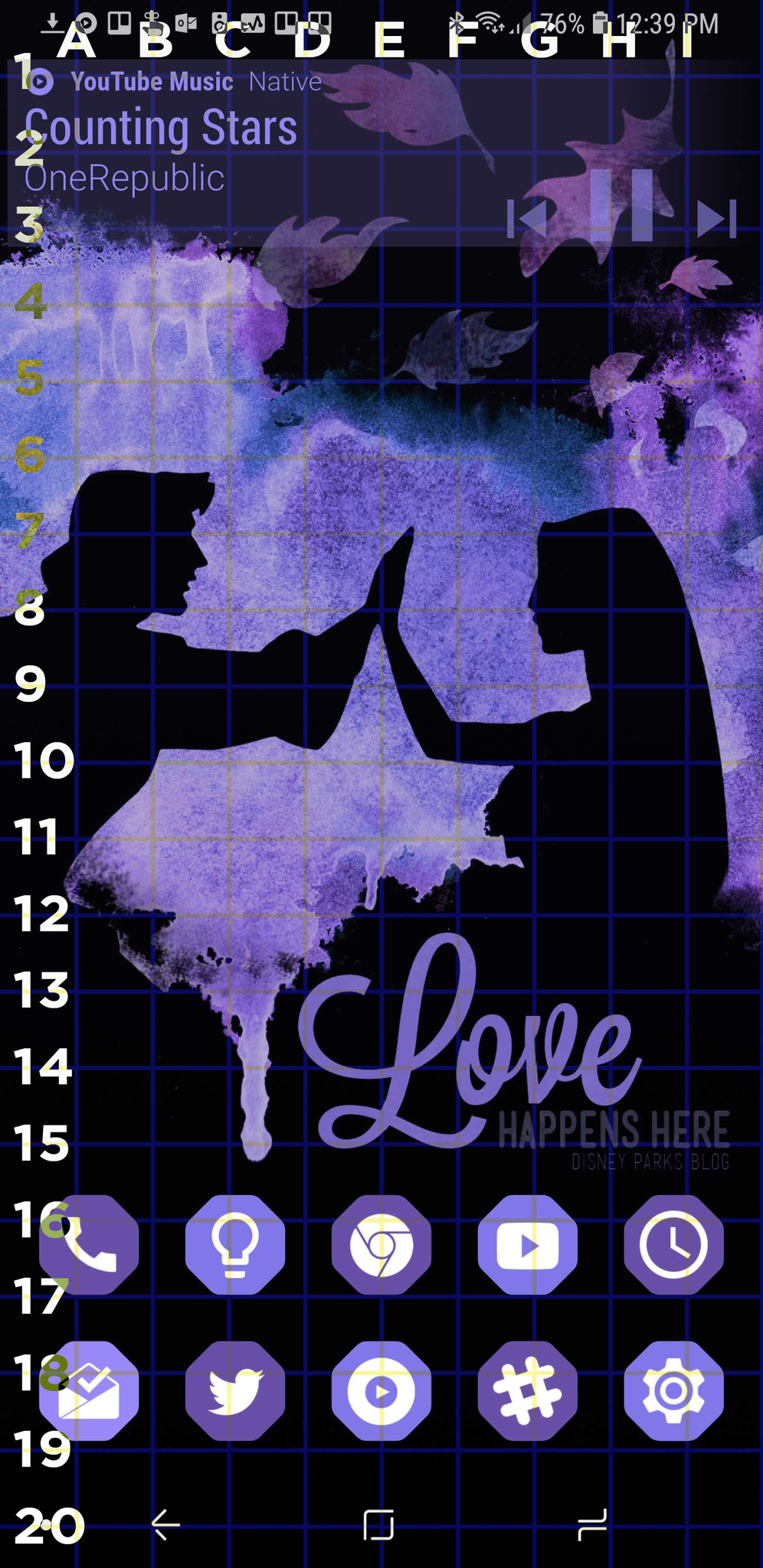
Instead of trying to dial in precise tap commands for specific commands on its own — tap commands that could change when the app updates its layout — smart assistants like Google Assistant could instead try to emulate taps another way: Battleship. By using a pre-determined grid system for coordinates, it would be possible for Bixby or Google Assistant to navigate the screen however we want without needing us to touch the phone.
"OK Google, tap screen point B7."
Allowing users to navigate their screen using their voice and standard coordinates would allow Assistant to interact with any app, letting users do just most smartphone tasks hands-free. Going beyond the coolness and convenience this could have for the everyday user, grid-based voice commands could be a huge boost to Accessibility navigation for those with mobility and dexterity problems.
What would you steal from Bixby?
Bixby may have ruined its reputation forever, but there's a silver lining in everything. What other silver linings and bright spots would you pull from Bixby before sending it up to that great big uninstall bin in the sky?
0 Response to "You Can See More: Google Assistant should actually take some notes from Bixby"
Post a Comment