24 hours with Google's latest Android build.
Android P has been available as a Developer Preview for weeks, but that was basically just Oreo with back-end API changes. At Google I/O 2018 we got the first proper beta release, which includes all sorts of visual changes and new features that better represent what we'll actually see when Android P is released.
The OTA update hit my Pixel 2 XL after signing up for the Beta Program, and I've been using it for about 24 hours now. This is how I'm finding Google's latest build of Android.
What I love so far
Gesture navigation
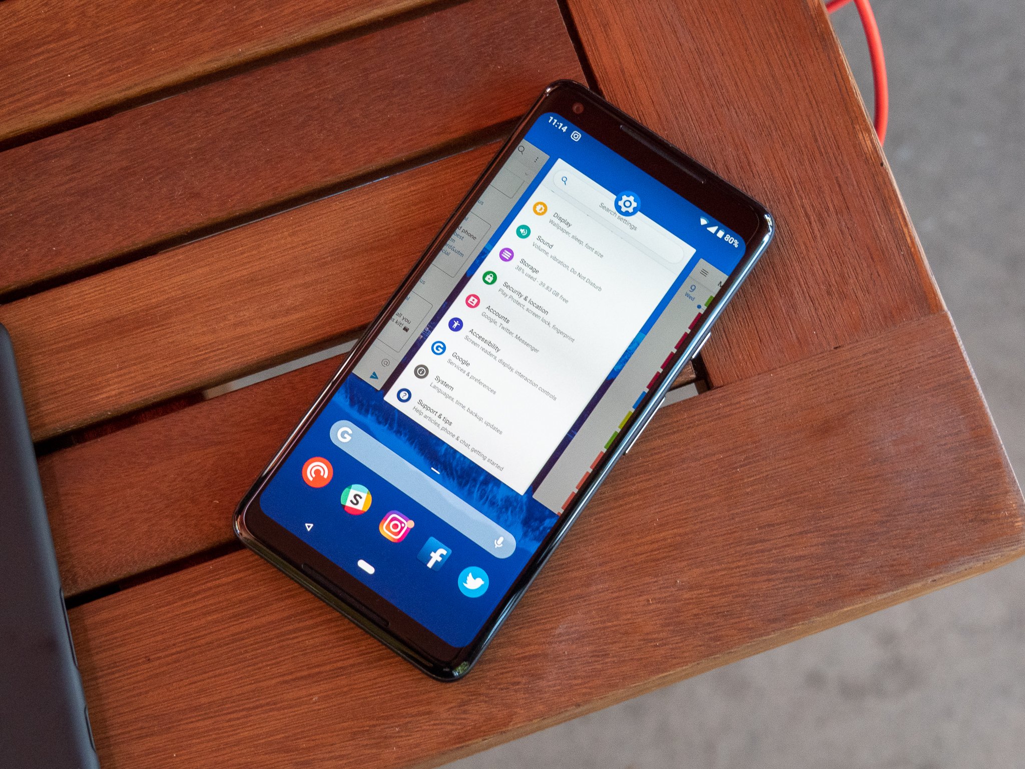
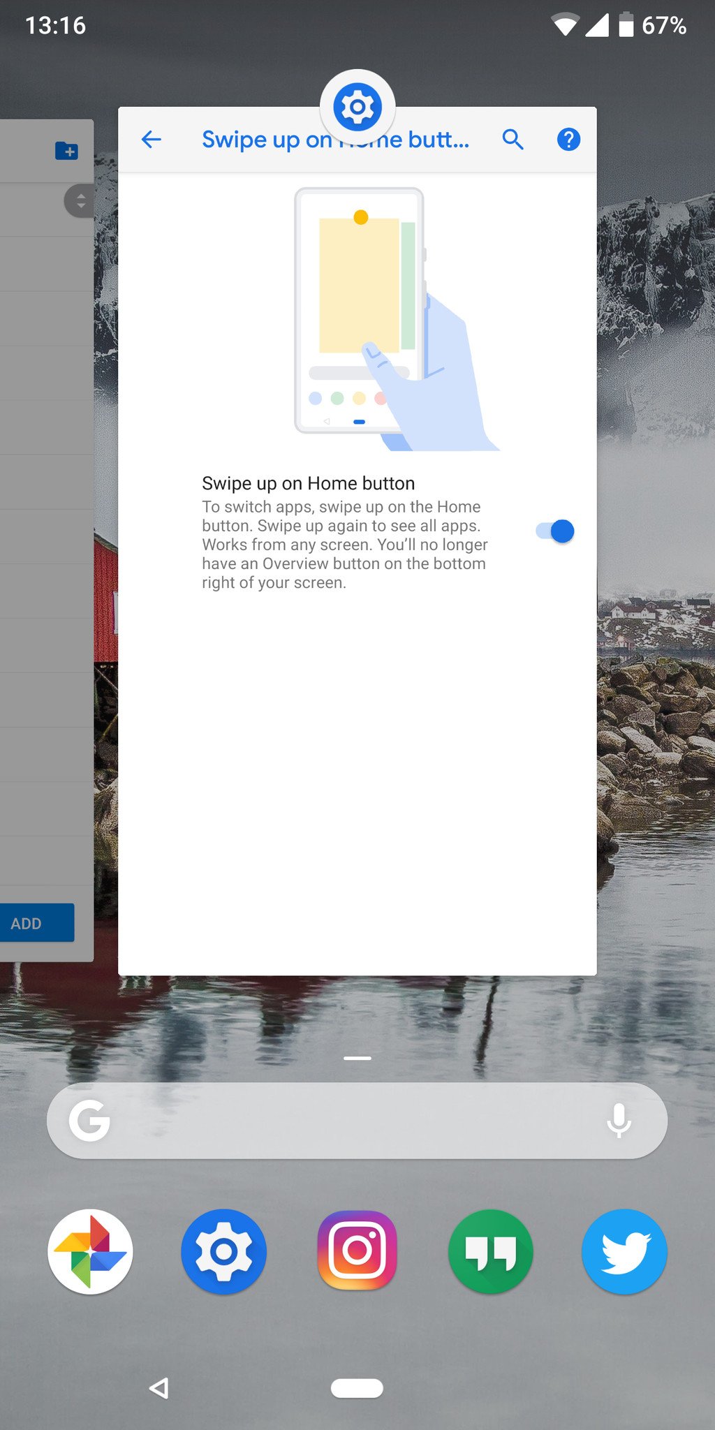
Google's rumored move to gesture navigation in Android P finally came true ... sort of. It isn't enabled by default even though this is a developer-focused release, and it's clear that Google has further work to do on the entire system. Still, I'm already enjoying it.
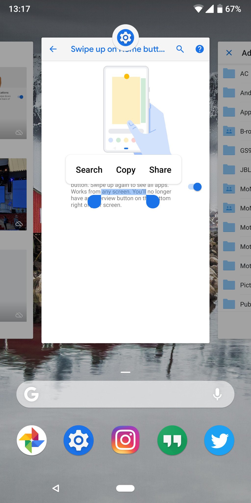
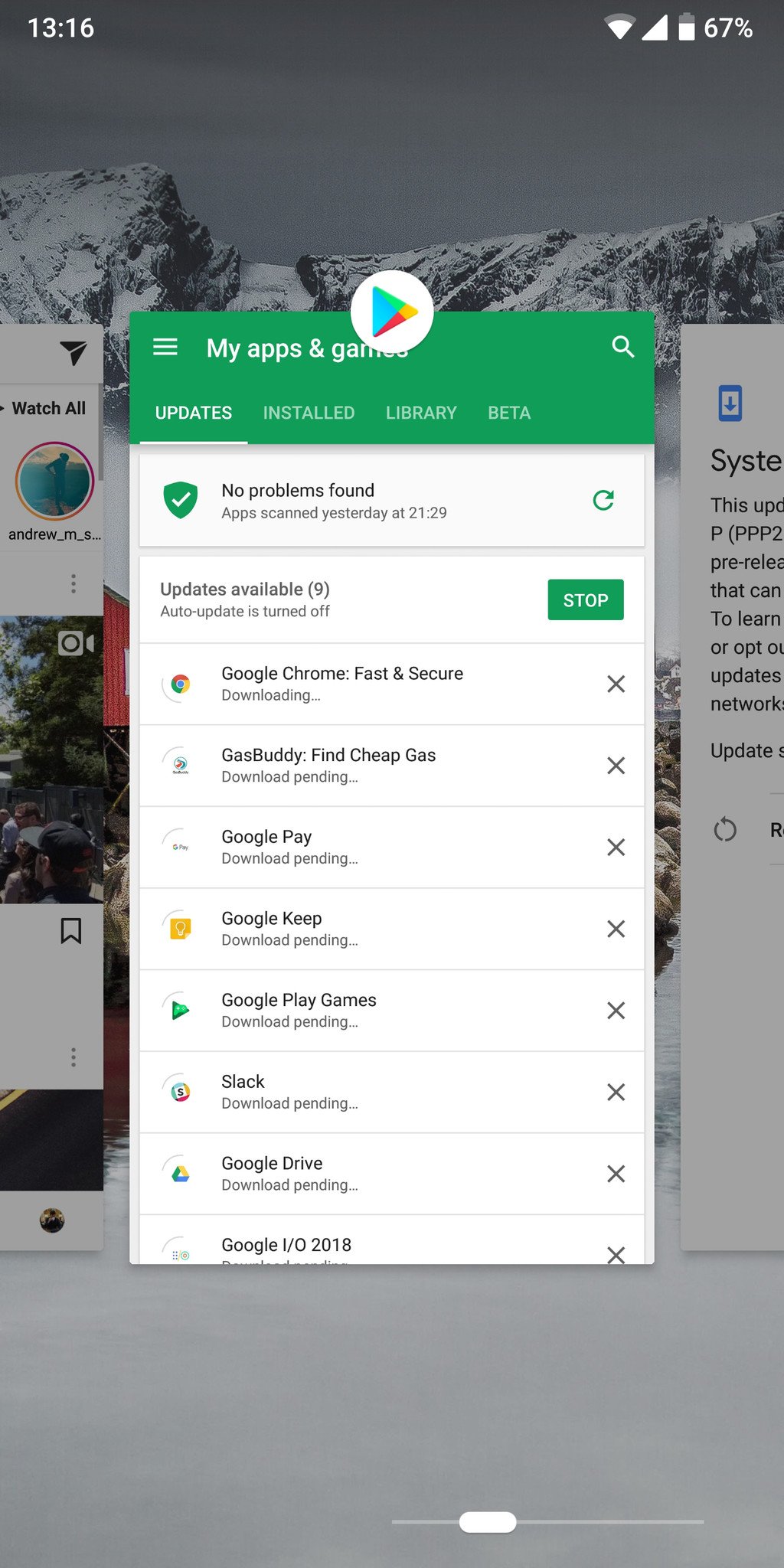
Swiping up to quickly hop into a multitasking view already feels natural and more involved than before, and staring at a static multitasking button when you're not using it seems archaic by comparison. Getting a full view of apps in a carousel makes it easier to quickly identify apps and hop into them, and being able to copy text while in multitasking view is a neat addition. The quick swipe right on the home button to hop between apps is fantastic.
There's also a big signal here that the back button isn't shown by default when you enable gesture navigation — it only appears when an app can make use of it. Sort of like the menu button popping up in your navigation bar when the switch to on-screen navigation first began. Google's clearly thinking about how it can improve the experience of the back button in Android.
New animations
One of the biggest things that gives a phone its "personality," for lack of a better term, is animations and transitions. Android P has added back in lots of more pronounced and longer animations throughout the interface, particularly in the new gesture-based multitasking interface. Apps and windows kind of zoom in and out of frame, making it feel like they're moving around in a wider space than what's visible in your phone's screen. There's a little more fluid movement here than what we're used to in the original incantation of Material Design, but I feel like it's an improvement.
Some will hate how slow the animations are, giving a feeling that the phone is slow or trying to mask what would otherwise be delays in apps opening, but I think it adds a nice feeling of liveliness to the system.
Battery info and controls
Google is working to improve battery life in the next version of Android! Never heard that one before.
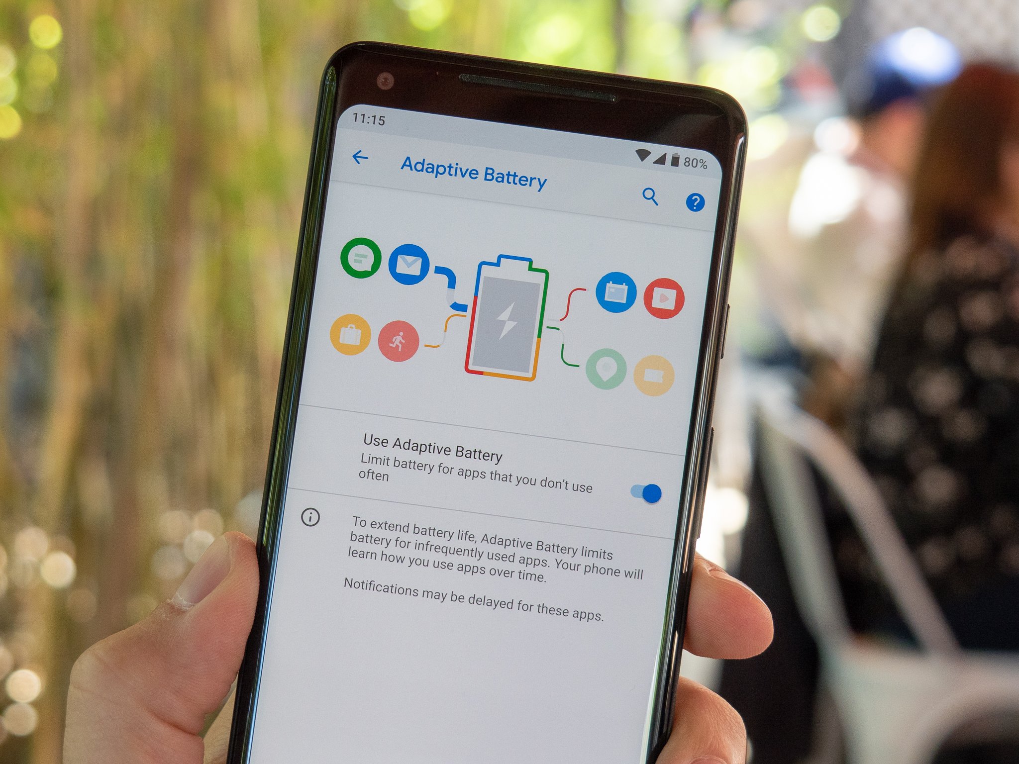
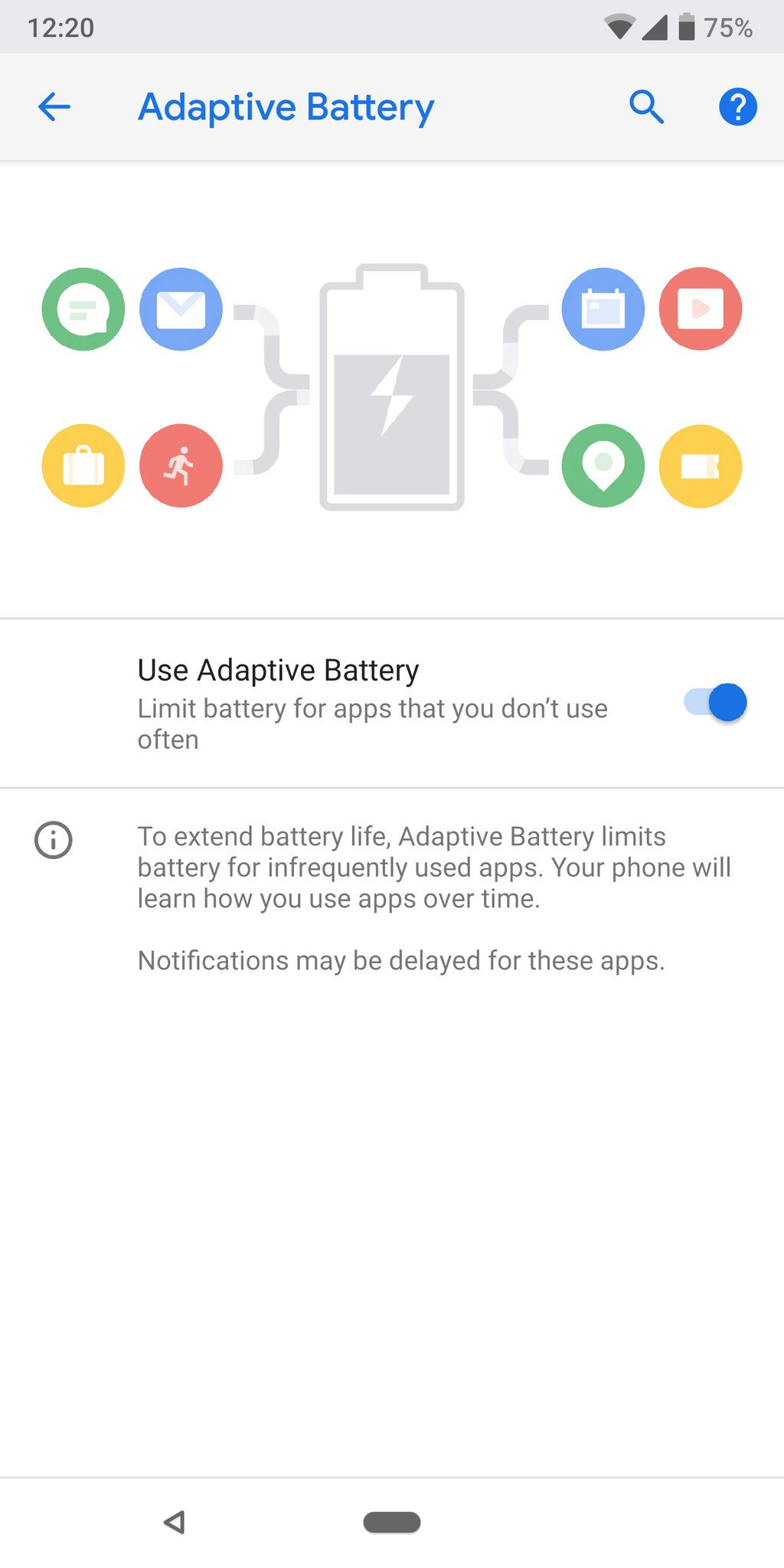
Seriously, though, Google is doing some really smart things in Android P. The new "Adaptive Battery" feature uses AI to watch how you use apps, and will dynamically adjust how those apps can use power depending on how often you use them. For example an app that you use infrequently may not get full access to use power at any time, while others you use sometimes will only get access when you have lots of battery in reserve and apps you use frequently will be given priority no matter your charge level.
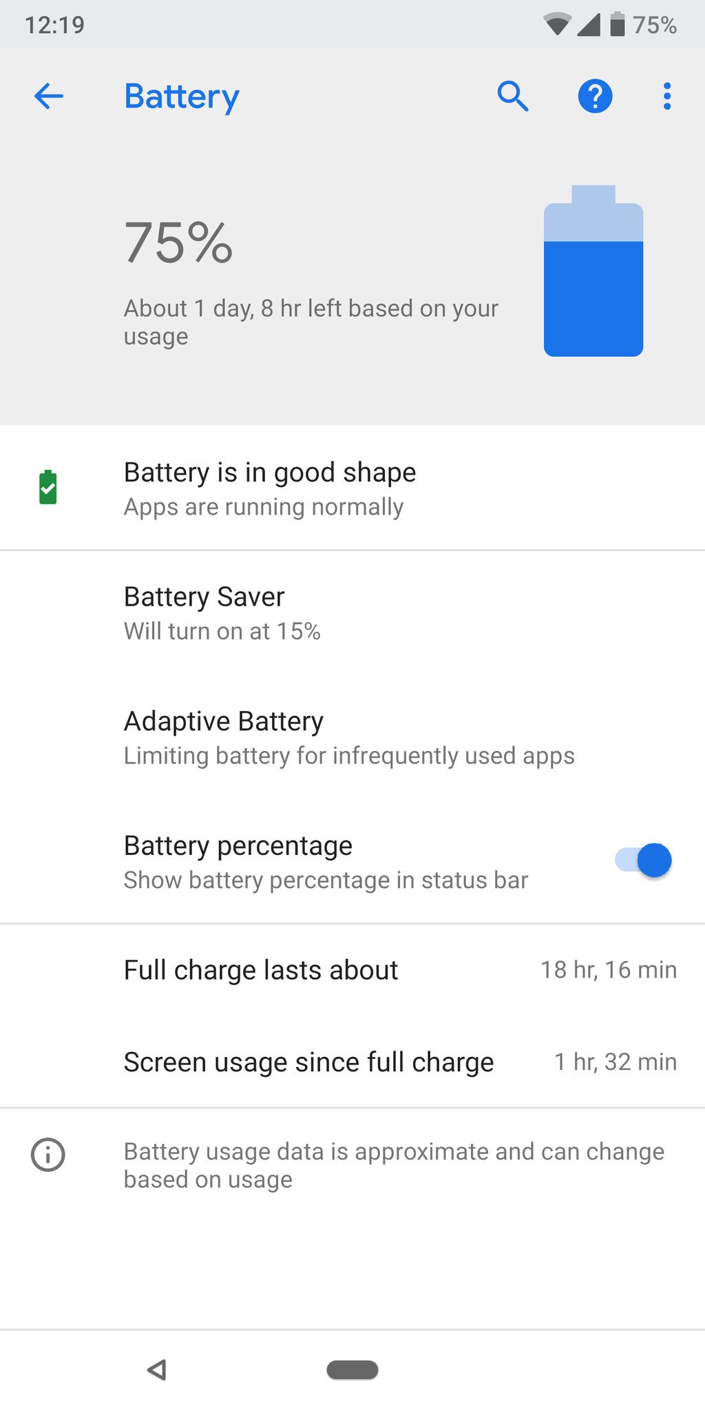
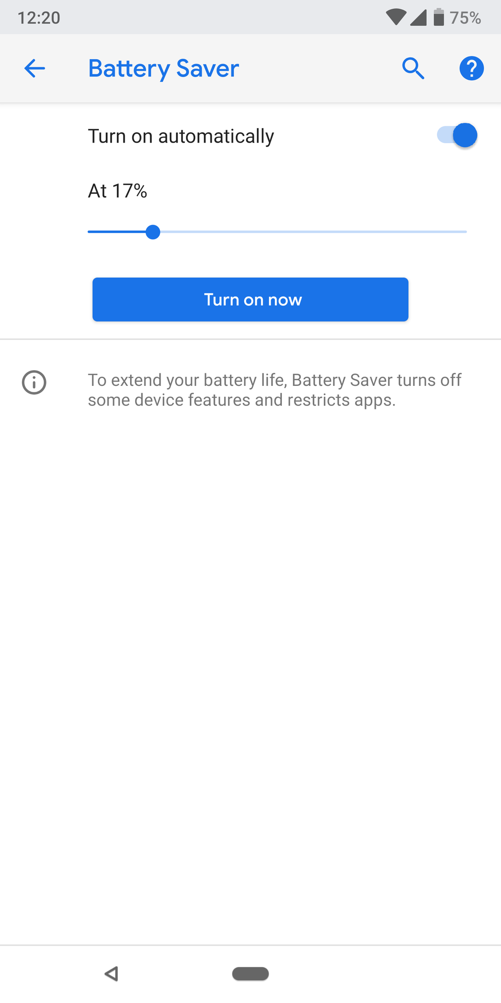
The general Battery settings are also just more useful for giving you the few bits of important information you need. No more graphs and charts that are confusing (and often misleading) to normal users — you get an overall readout of how your battery health is, and a information on how long your battery lasts on average. The "Battery Saver" mode also lets you set it to enable automatically at any single battery percentage, anywhere between 75% and 5% battery. I think I'll set mine to turn on at 17%, just to be unique.
Smart people-first feature changes
I could easily break out each of these features and write 500 words about why they're so great, but I'm bundling them together into what I call "people-first features." Google talked a lot about this whole "digital wellbeing" idea at I/O 2018, focusing on using technology less, and that's part of an overall focus on how people use these phones. Here are my favorites:
- Volume controls: When you press the volume keys, the volume slider pops up next to the keys — it also controls media volume by default, because we don't need to change our notification/ringer volume as frequently. Press and hold power + volume up briefly to immediately switch to vibrate mode. Flip the phone face-down on a table and it silences the entire system.
- Auto brightness: Your brightness slider is no longer controlled by a fixed set of values. The phone learns how you set your brightness in different ambient lighting conditions, and starts to use those brightness levels automatically.
- Auto rotation: Rotate your phone to landscape, and see a small icon in the bottom-right corner of your status bar that you have to tap to confirm the rotation of your screen. Turn back to portrait, and you do the same. So now you can have rotation when you want it, and no accidental flipping around when you just want to reposition your hand momentarily. You can still turn on full automatic rotation, but why would you when you have this? I've been calling it "two-factor auto rotation," personally.
- Better Do Not Disturb mode: More on that digital wellbeing front, Android P takes Do Not Disturb very seriously. By default, DND hides all audible and visual disturbances, including the ambient display, the entire notification shade, notification dots and status bar notification icons. You can turn back on one or all of these things, but the default shows that Google wants your phone to actually not disturb you when in DND mode. By default, toggling on DND is also set without any expiration — you have to enter the settings to enable the option to set it for a fixed amount of time.
What I hate
Also ... gesture control
For as much as I love the new gesture system, it's both broken in places and deeply flawed in others.
- The home button: The combination of using the home button (or "pill" as we've started calling it, on account of its shape) as both a place to tap to go home and swipe up for multitasking, has led to a little confusion. It feels like Google could make a change here to make it all gesture based. The long-swipe or double-swipe for opening the app drawer feels unfinished as well — and Googlers here at I/O indicate that newer versions have smoothed it out considerably.
- The back button: The back button feels extremely tacked-on and not integrated into the gesture system at all — of course that's because it isn't a gesture at all, it's just a button. I could easily see the back button transitioning to a swipe left from the home button instead.
- Multi-window: The multi-window interface, too, feels like it hasn't received any work at all for this release. It's currently a four-step process: swipe up to access multitasking, tap on the app window's icon at the top, then tap "Split screen," then tap the second app you want. This will need to transition to some sort of gesture, too, if anyone's going to use it.
Again, gestures aren't even turned on by default in this first beta release, so I can't be too tough on it. There are changes that have to be made, but I'm certain Google will have made big strides here by the time Android P is released fully later this year.
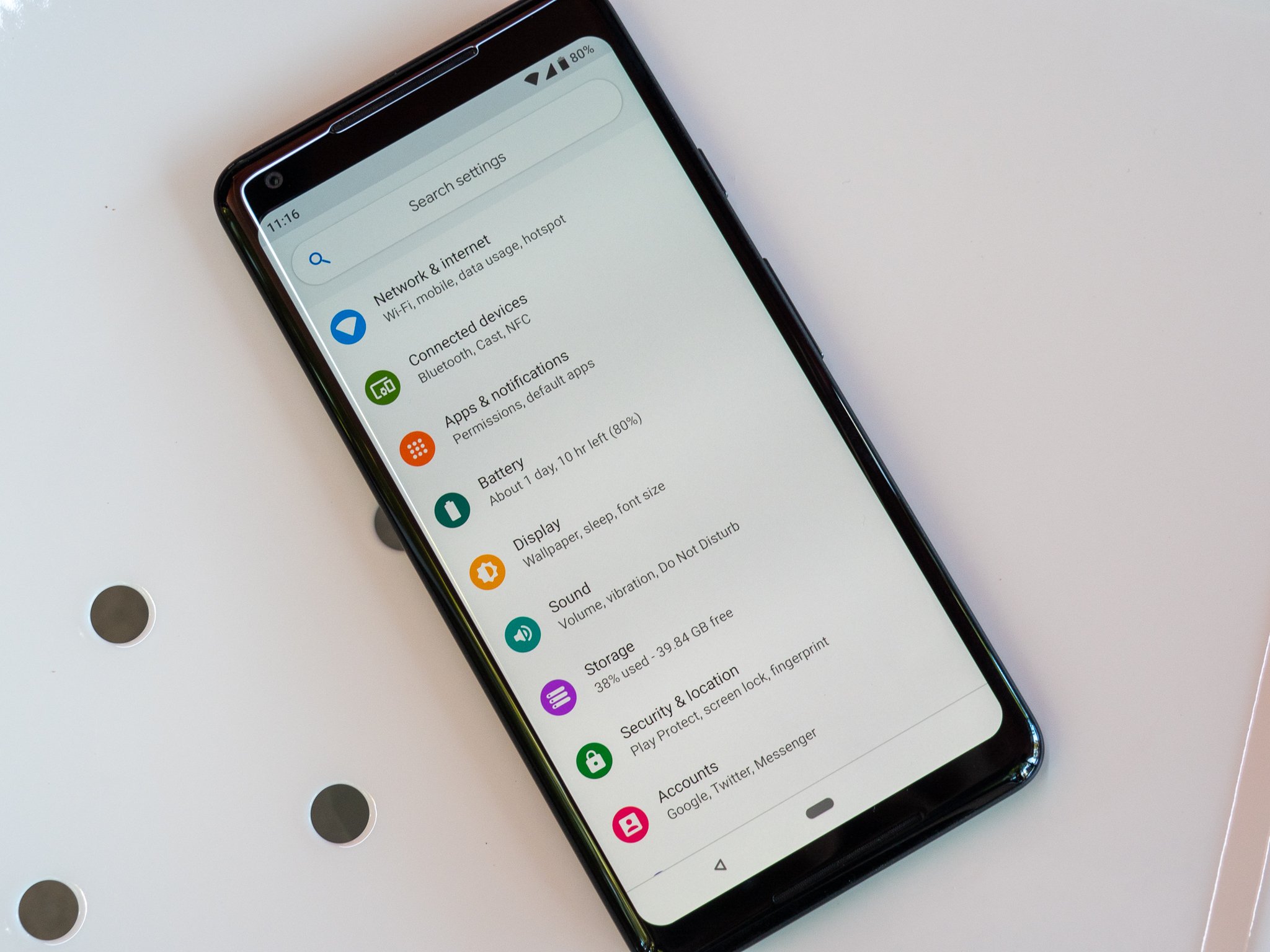
This color palette needs work
I'll agree that Nougat and Oreo maybe went a little overboard on the choice to go with flat, greyscale interface elements and Android needed some pops of color to add some life. But this is maybe a bit too much in the other direction.
The blue is a bit on the bright side and really clashes with the rest of the soft grey interface. The wide variety of colors found through the settings don't have much of a rhyme or reason, and just feel out of place as a result. It all reminds me of LG's recent software, actually. So much of the feel of a Pixel phone in particular comes down to the Google apps and Pixel Launcher, though, which have yet to be updates for Android P.
Coloration of an interface is one of those things that is very subjective, and also something that can be changed relatively easily if Google decides to make adjustments before release. It's also something that very few people in the grand scheme of Android will actually see — as just about every manufacturer applies their own design changes to Android, at the very least changing colors even if they keep a "stock" look otherwise.
Status bar troubles
The clock moved to the left side of the status bar! Yes Android P is trying to be friendly to phones with display notches, and moving the clock to the left helps it do that. But not all phones with Android P will have notches, and the clock on the left is really throwing me off. It gives you less room for notification icons up there, which (at least right now) also truncate into an ellipsis where the notch would roughly be, and takes away that ability to glance up and say "okay, no notifications right now!" when you see an empty corner.
This very easily could change before release or be an option for configuration at the manufacturer level if the device being made doesn't have a notch, so I'll reserve judgement at least a little bit here — but I really hope the clock only goes on the left for phones with notches. Please, Google?
Stability
I feel bad even having this listed as a downside of software that's very clearly a "beta" release, but this first Android P Beta build is in no way stable enough to use on a daily basis on a primary device. Multi-window almost always crashes the phone's launcher, lots of apps just crash unexpectedly (including many of Google's) and every once and a while you'll just see visual jank that throws you off.
I wouldn't recommend installing this first beta release on your primary phone unless you're really wanting to walk on the bleeding edge. But I know this will improve over time, and I have no doubt that the final release of P will be just as solid as O and N before it.




0 Response to "You Can See More: Android P Beta hands-on: The best and worst features"
Post a Comment