Gmail for the modern era.
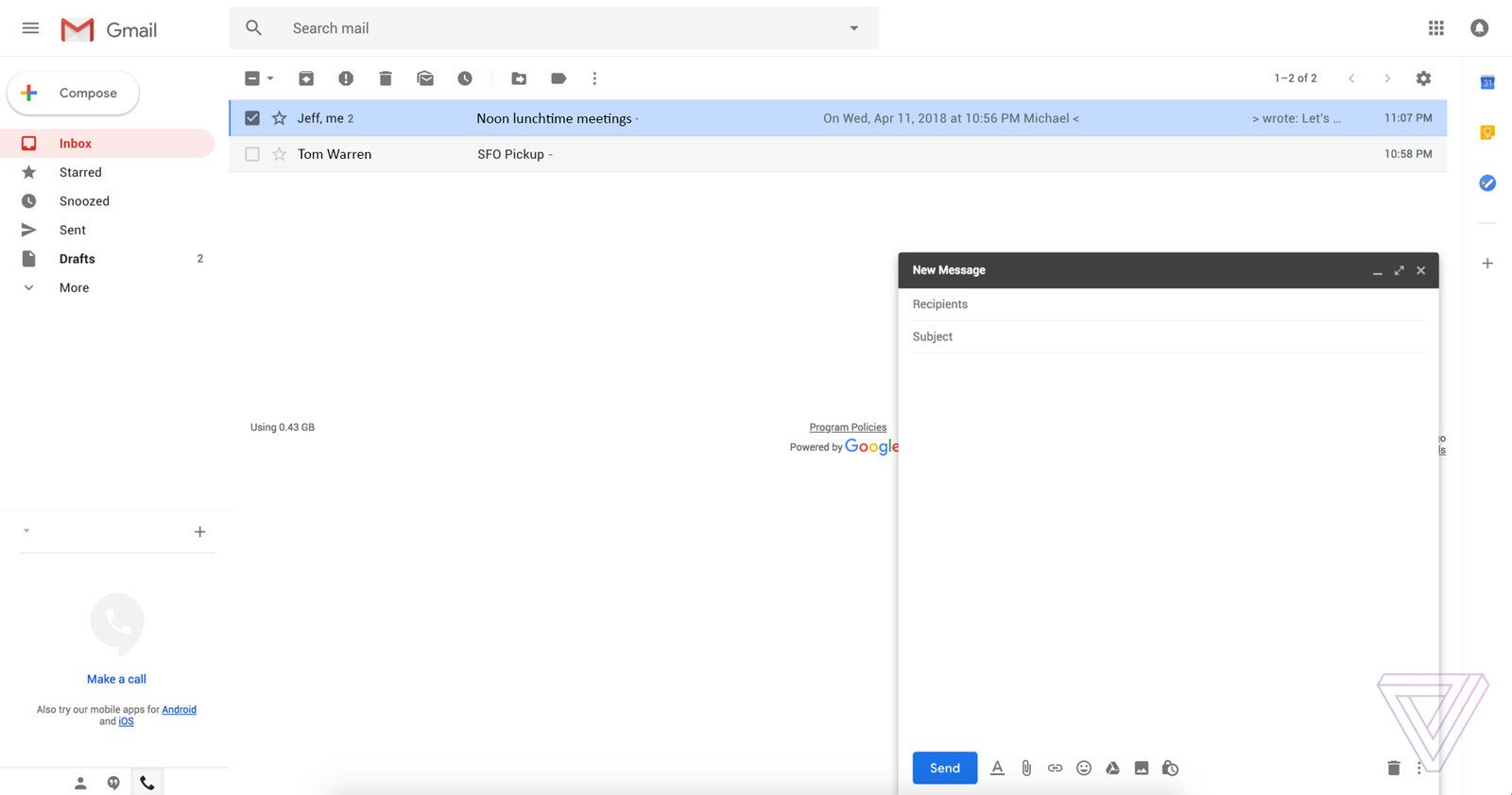
In the "coming weeks", Google will introduce a huge redesign for Gmail. Something along these lines is long overdue, and thanks to recently shared screenshots, we now have an early glimpse at what Gmail's new desktop interface will look like.
Obtained by The Verge, these screenshots reveal that Gmail's new aesthetic lines up nicely with the design language found in a lot of Google's other apps. Corners are rounded, there's a hamburger menu in the top left next to a fresh Gmail logo, and the red "Compose" button has been replaced with a white, circular one with a colorful "+" icon.
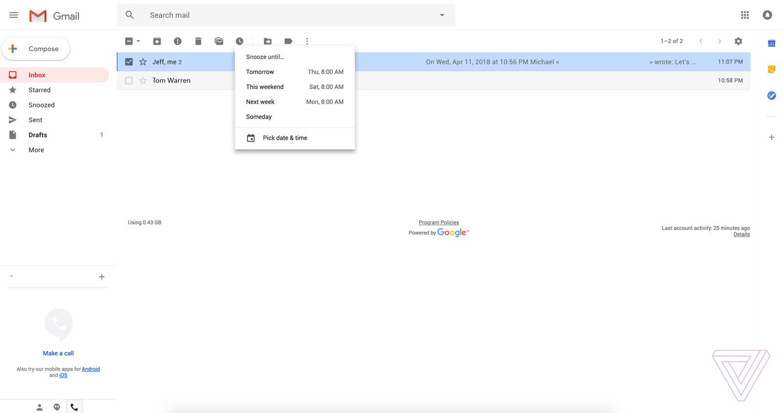
Like we already caught wind of, the images also showcase Gmail's new Snooze functionality that allows you to dismiss emails from your inbox for a certain period of time — something that was first made popular with Inbox back in 2014.
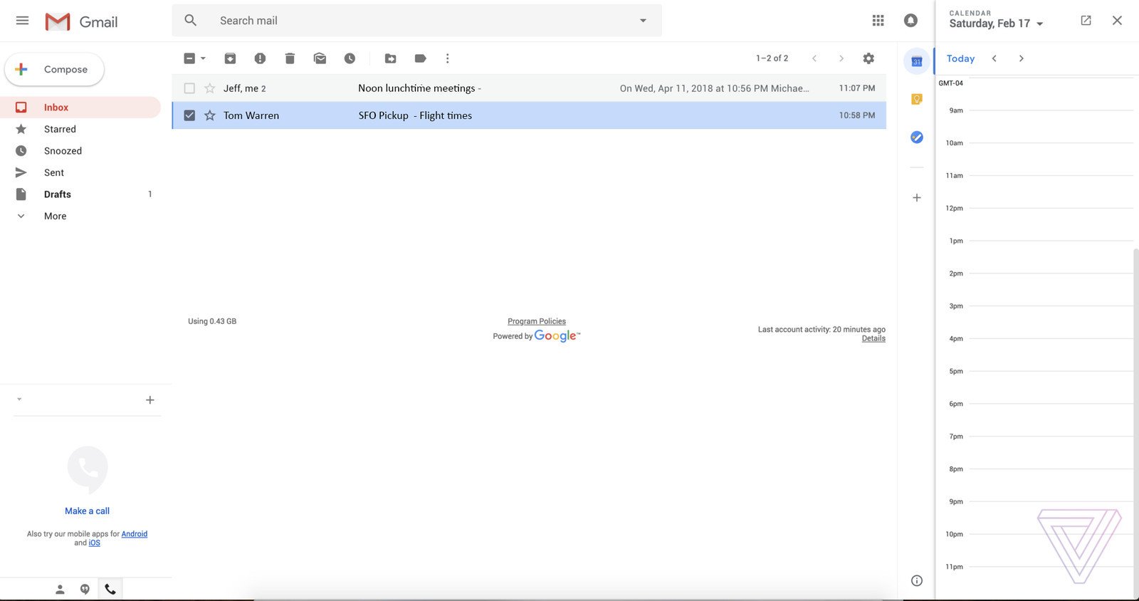
One thing shown that we weren't previously expecting is a new sidebar found on the far right. This allows you to quickly open Google Calendar, Keep, and Tasks without having to leave Gmail, and it would appear that you'll be able to add additional apps to the sidebar as well.
Last but not least, Google's added three layout views that'll allow you to change how your mail is displayed. The default setup will showcase things like photos, documents, and other items that are attached to message, a comfortable option will remove these attachment highlights, and compact mode will show more emails on your screen at once.
It'll still be some time before these changes make their way to all Gmail users, but seeing as how Google I/O is right around the corner, it's safe to assume we could get more details on Gmail's updated look during the upcoming developer conference.
A new Gmail design is launching 'in the coming weeks' with several fresh features


0 Response to "You Can See More: This is an early look at Gmail's new design for desktop"
Post a Comment