Spotify's app has needed on overhaul for a while, and it came to its non-paying users first.
Spotify's Free service is — at its heart — meant to lure you in and then convince you to pay for Premium, To this end, Spotify has rolled out a shiny new update to its Android app that's meant to help draw in more new users and convince them to pay for Premium.
And it is every bit as annoying to use as it is beautiful, so congratulations, Spotify, you succeeded.
PYT (Pretty Young Theme)
The new look for Spotify Free is quite enticing, from simplifying the tabs and the layout to giving the playback screen an intimate and dare I say sexy new look. We now have four tabs instead of five, but since one tab is a giant ad pushing you to Premium, we're going to ignore it and focus on the other three:
- The Home tab has been simplified tenfold. Where there was carousel after carousel of genre playlists and promoted playlists, there are now only three things: a single carousel of Recently played, a small section of Made for You mixes filled with the artists you confessed to liking when picking bands during setup, and Play on demand, the playlists that Spotify still lets you use like traditional playlists. We'll get back to that in a bit. The new, scaled back Home tab is a breath of fresh air, and helps avoid overloading users who don't know what they want to listen to.
- The Search tab has absorbed the Browse tab, so now we have a search bar and a genre list below it. Tapping a genre will show you the usual featured playlists, podcasts, artists, and albums for that genre for you to peruse. If you want to see what you've recently searched, tap the search bar and your recent searches will appear.
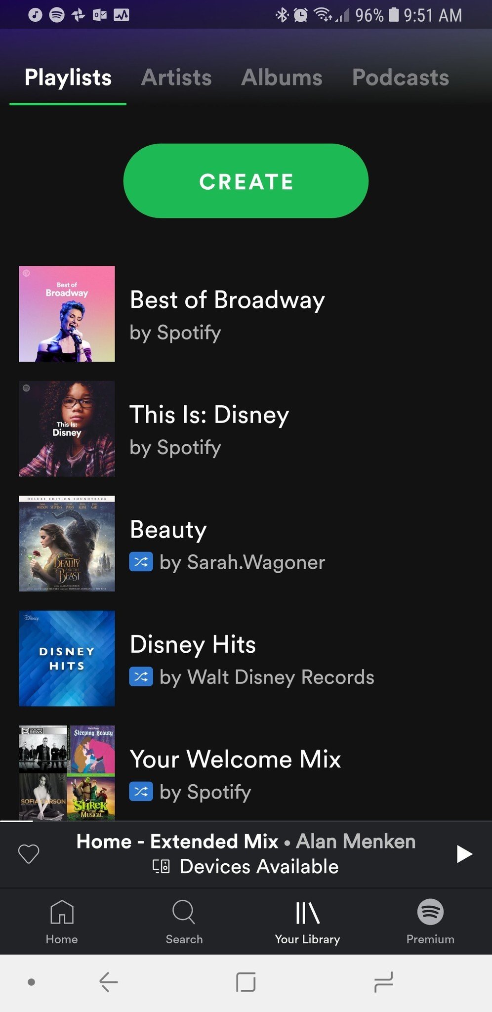
- The Your Library tab features four mini tabs of its own: Playlists, Artists, Albums, and Podcasts. If you want to replay what you've listened to recently, you'll need to use the Recently played carousel on the Home tab. Noticeably missing from this tab: a list of your favorited Songs.
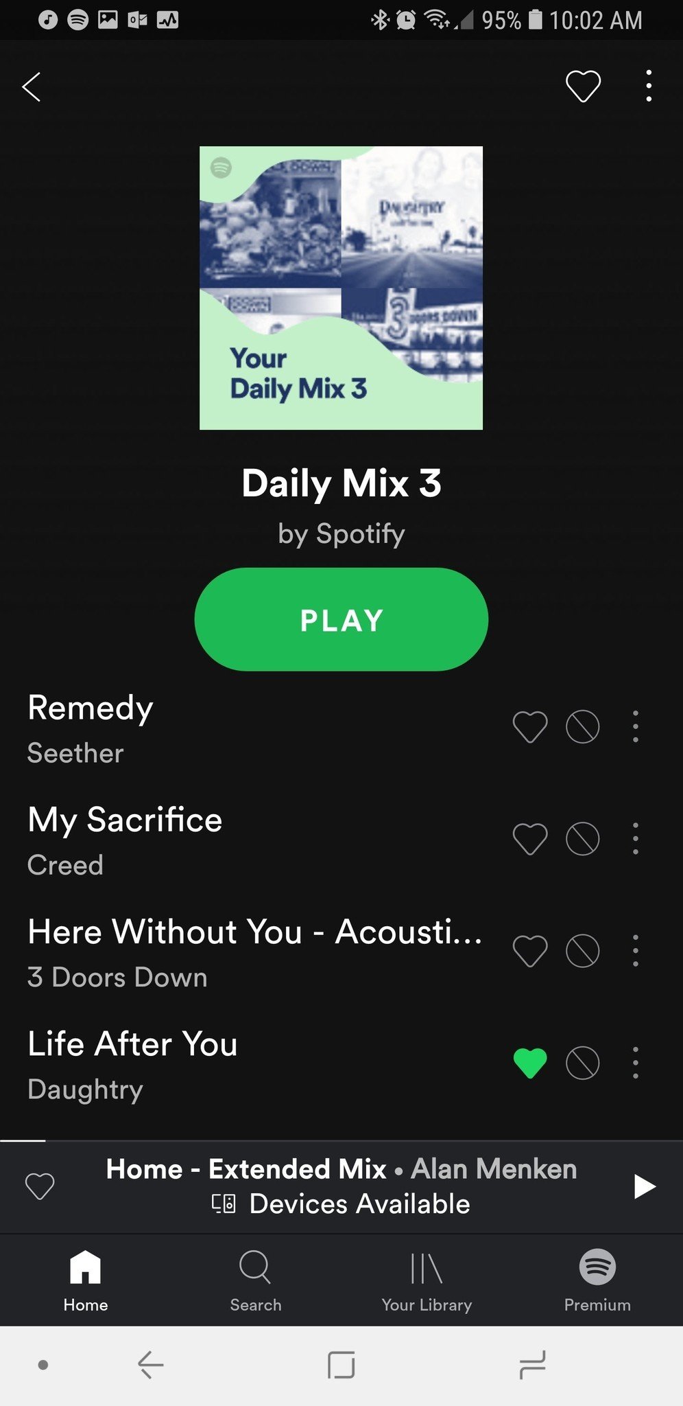
You'll notice I said favorited instead of saved. The new Spotify Free now uses the Favorite icon on songs, albums, and artists to add them to your library instead of having users Save to library, a name which may have caused some confusion for users who thought Save meant downloading for offline listening, which is unavailable for free users. The Favorite heart that appeared in radio stations on the old Spotify is now pretty much everywhere, and next to every song in a Play on Demand playlist — or the track listing hidden on an album — you'll now have three icons instead of one: Favorite (heart), Block (No/banned symbol), and Menu (three vertical dots). This can allow users to quickly add slews of songs and block songs they hate, but it also makes the song listing page look a bit more cluttered.
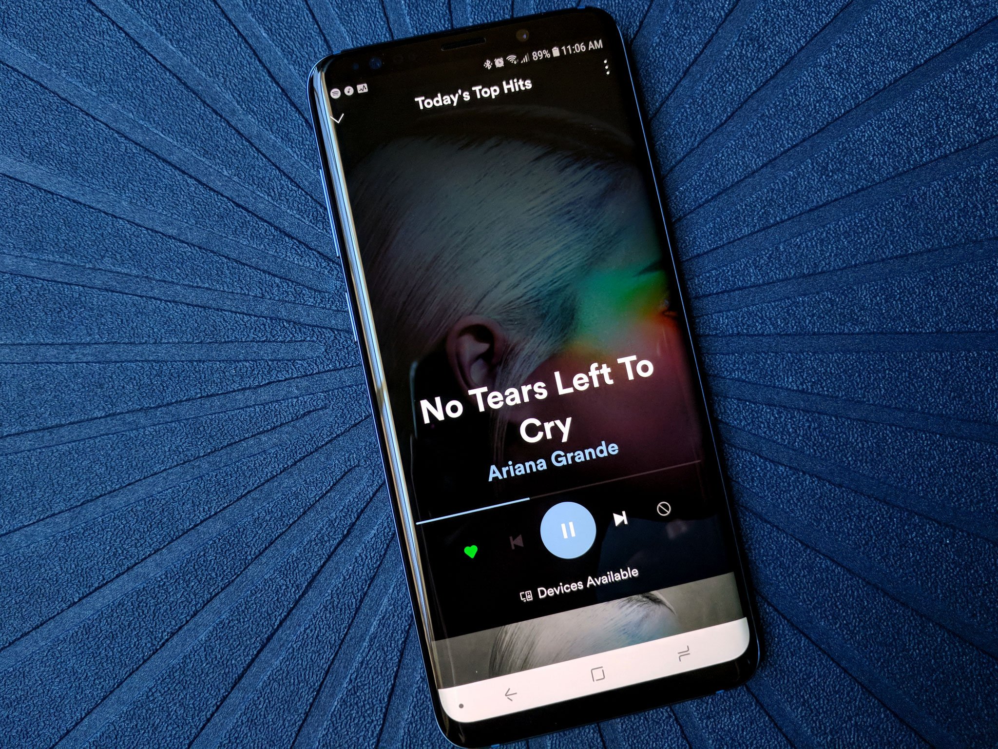
Once you start playing something, you'll see the most drastic — and most beautiful — overhaul in the Spotify free update: the playback screen. The album art is now stretched to take up the full screen, with the Artist name, playback bar, and play/pause button now steeped in the color of the artwork for most tracks. This reminds of the Google Play Music playback window — except, y'know in a dark theme and done properly. It's beautiful, and I was quite disappointed when I logged back into my Premium account and had to kiss it goodbye.
You need some TLC
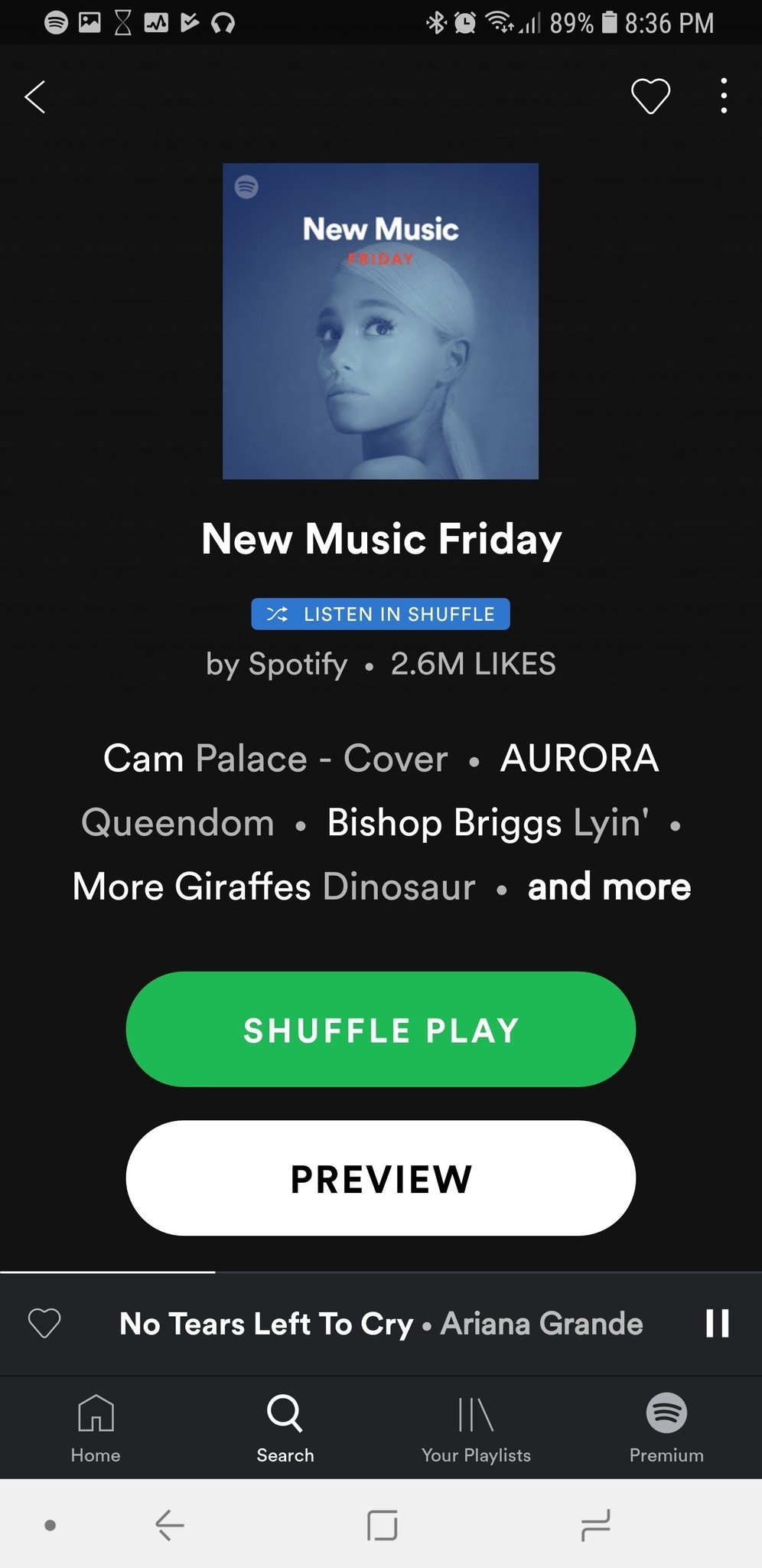
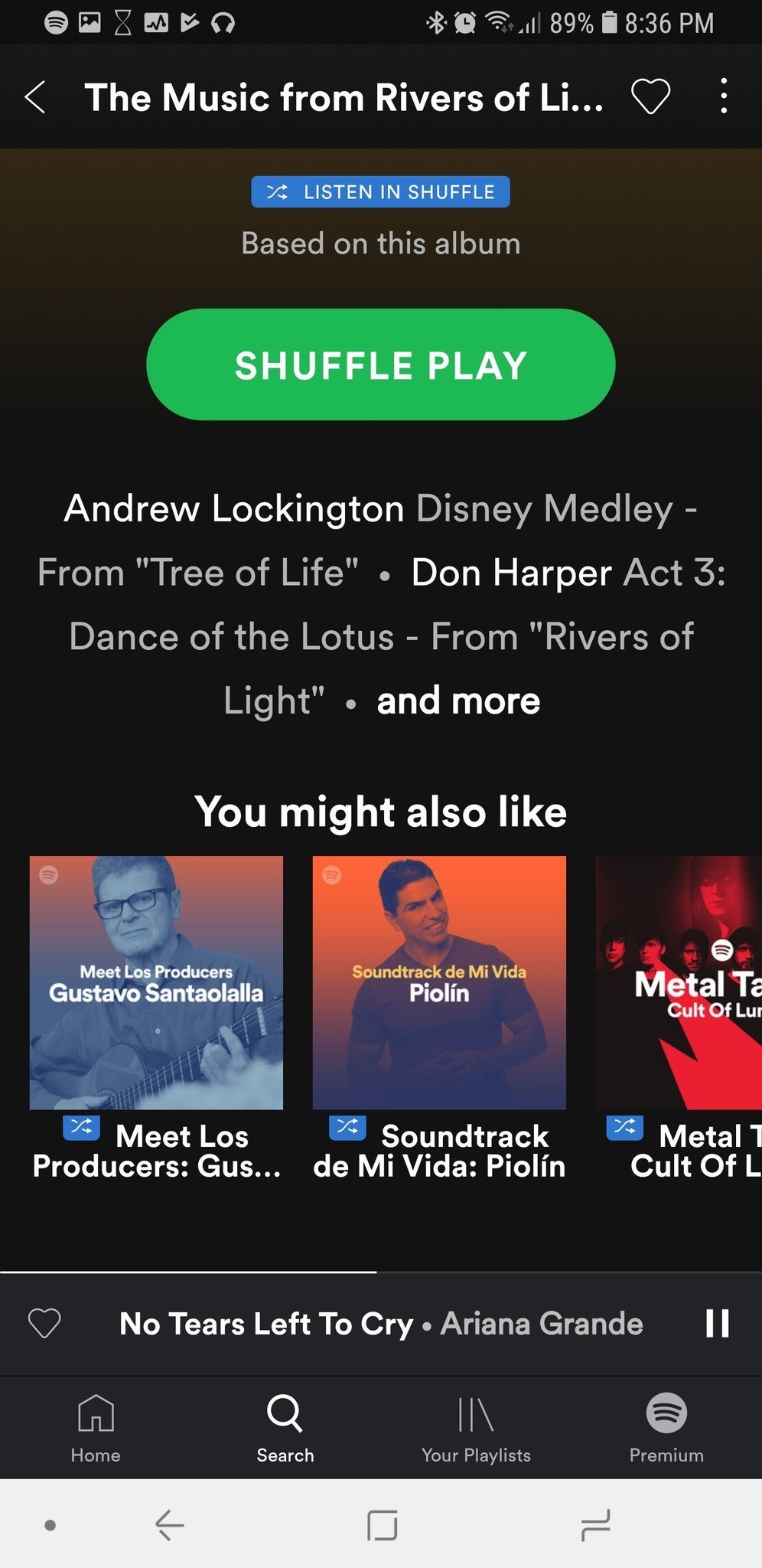
The new Spotify Free is prettier than Premium, but every Free user would probably give up the makeover happily just to be able to get a little more usefulness out of the app. Let's start with biggest, bluest thorn of all: the Listen in Shuffle icon. This little devil appears on almost every album and playlist on Spotify Free now, except for the highlighted 'Play on demand' section in the Home tab.
Shuffle Play was the default on Spotify Free before, but Play on Shuffle goes a small step further, especially when playing albums. On Spotify Free's new mobile experience, you can't play an album on shuffle; instead it will play a shuffle "Based on this album", which will slip in other songs that may or may not fit the album. This wouldn't be so insidious on its own, except that you only have 6 skips an hour, and these intruder tracks can burn them up quickly.
On this version, you can't pick which song in an album or playlist you start with. If you tap the tracks contained, go to the track listing and tap a song, it'll play a snippet of the song, but not the song itself, which is a major fake-out and is likely to make a number of Free users scream the first time it happens to them. I know I did.
The only playlists where tapping a song actually gets you that song are the 15 'Play On Demand' playlists. These are some of the most popular genre playlists on the service, and chances are you'll find one or three you like. Between this and some expansive playlists, you can probably squeak by on this new Spotify Free without losing your mind.
Probably.
Next stop: Spotify Premium
That said, the goal of this little nip-tuck on Spotify Free is to get more people to sign up for Spotify's paid service, and this nudge will likely drive more than a few longtime free users to Premium, but it may also drive some free users away for good. Spotify already has ads every few songs and collects its own little nest egg of information on its listeners, and the experience on Spotify Free is far less limited on computers than it is on phones, so this update may simply lead some free users to simply forgo the Spotify mobile app and only stream from their work or home computers.
One other thing is quite clear: the free version of the Spotify app is prettier than the paid right now, and that's got to change. It's unclear how long it might take Spotify to shift to this new layout, but at least the playback UI needs to get updated, pronto. Ara wants her colorful, full page playback screen.
So, did the new Spotify update push you off the fence and into a subscription? Did you finally wash your hands of Spotify and move to something else? Is the new UI pretty or just pretty annoying? Whatever your decisions or your thoughts on the update, we want to know them! Share them in the comments, along with whatever you're listening to right now.









0 Response to "You Can See More: Spotify Free app update: Everything you need to know"
Post a Comment