Home, Back, and Recents are replaced with a single pill.
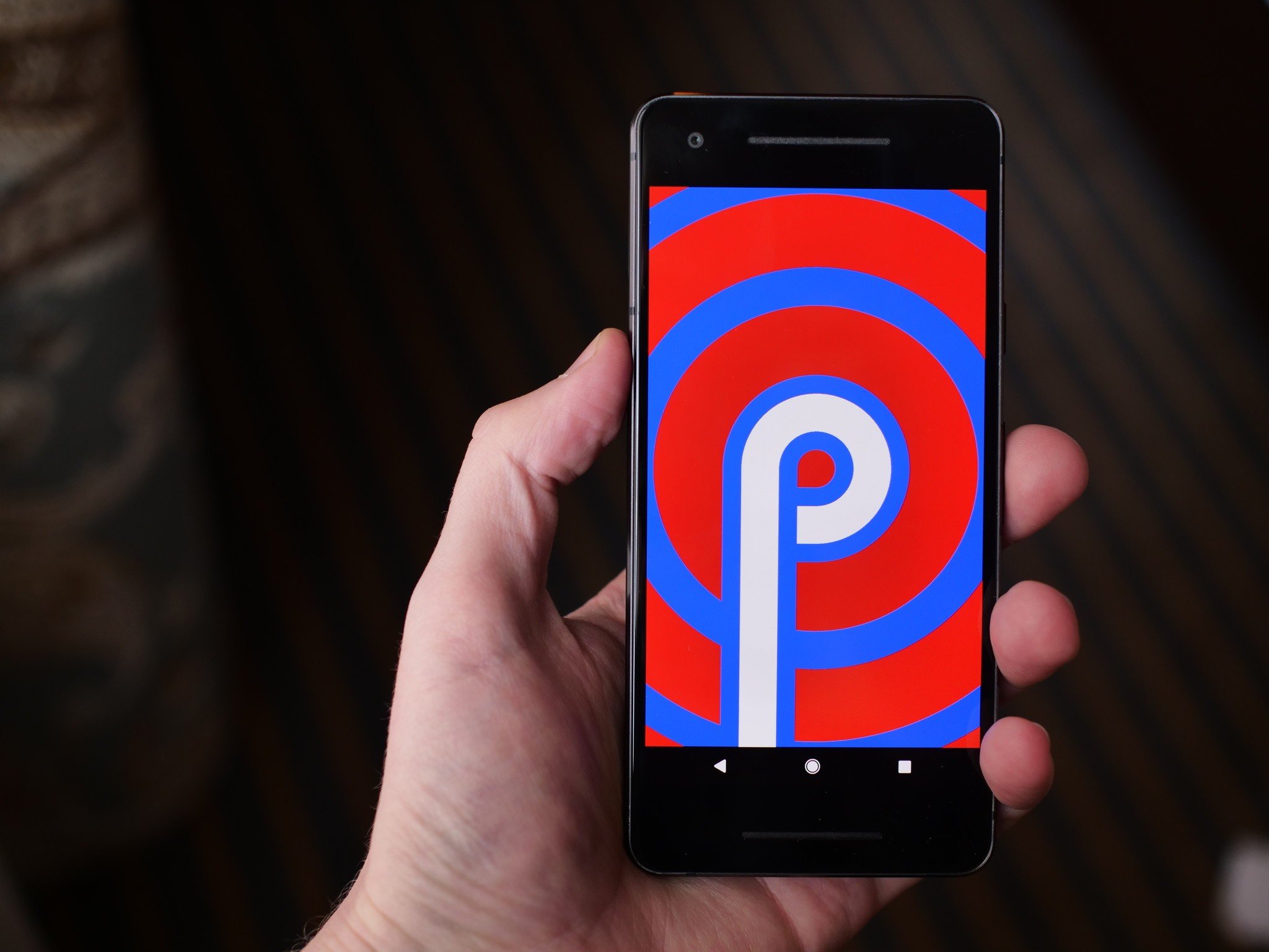
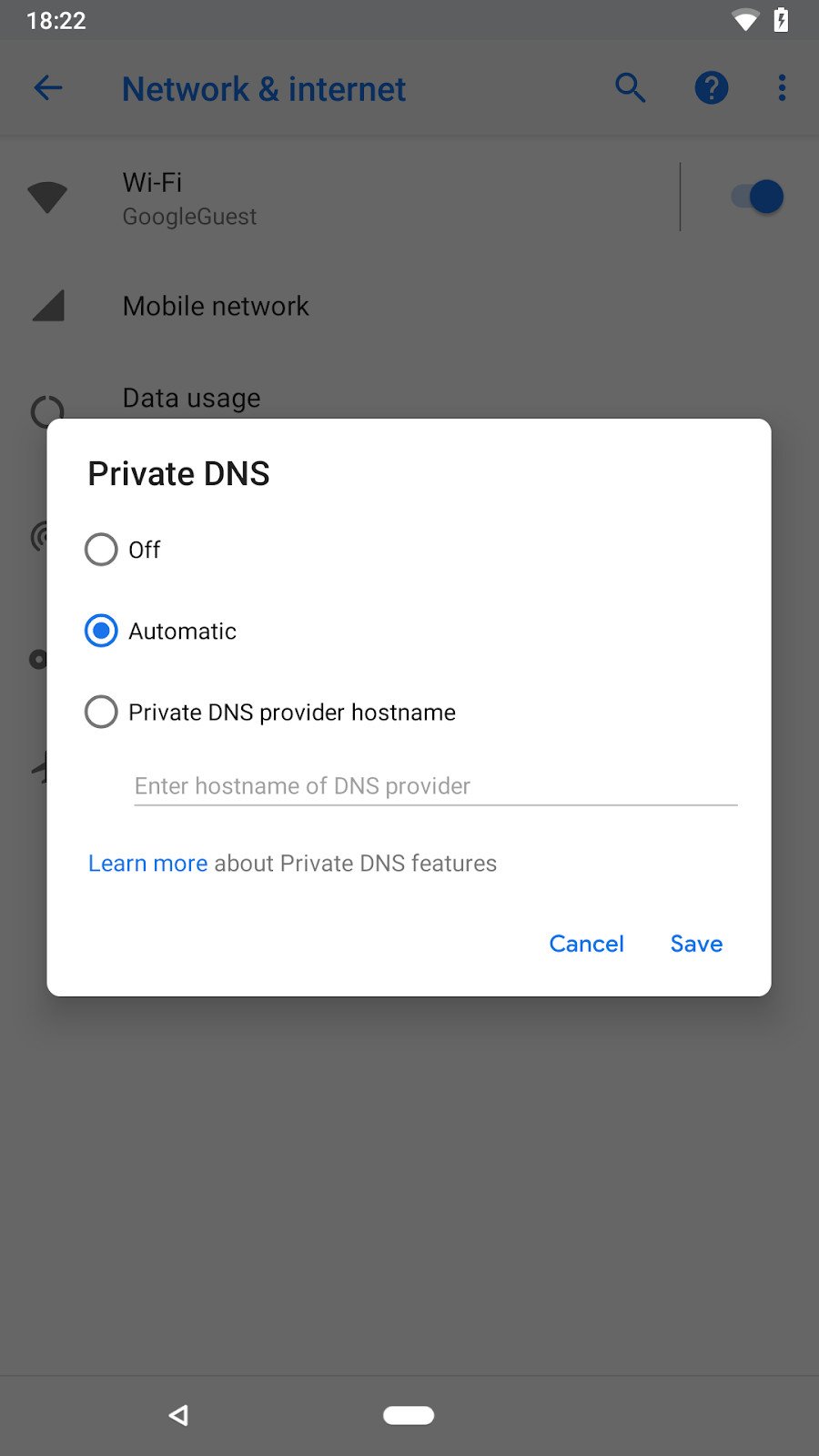
Android P's first developer preview has been out in the wild since early March, and it's offered a nice glimpse into what the future of Google's mobile OS has to offer. Thanks to a screenshot shared on the Android Developers Blog, we might now have our first look at Android P's new navigation bar.
First spotted by 9to5Google, elements like the clock on the left and rounded corners for the pop-up box confirm that the screenshot was taken on a device running Android P. These are things we've seen before, but at the very bottom, we see an all-new navigation bar design.
Instead of the traditional Back, Home, and Recents buttons, there's a pill-shaped icon where the circular Home button usually is and a Back button next to it with the old, un-filled Lollipop/Marshmallow design.
Although nothing's been confirmed, the design of the nav bar suggests that Google may be trying to mimic Apple and introduce a gesture-based navigation system to Android. 9to5Google further reports that swiping up from the bottom brings up the multitasking page and the back button is only revealed when there's something overlayed on the screen that can be dismissed.
Google quickly cropped the screenshot to hide the navigation bar, and to put even more fuel on this fire, the pill icon looks awfully similar to leaks of the Moto X5 and Moto Z3/Z3 Play from earlier this year.
Could this be our first look at Google's new direction for Android's navigation? Perhaps. But on that same note, this could also be nothing more than a mockup that someone added to the screenshot just for the heck of it. Google I/O will begin in just over two weeks, so I suppose we'll learn more then if this turns out to be legit.
What are your thoughts on a gesture-based navigation system for Android?


0 Response to "You Can See More: Is this Android P's gesture-based navigation bar?"
Post a Comment