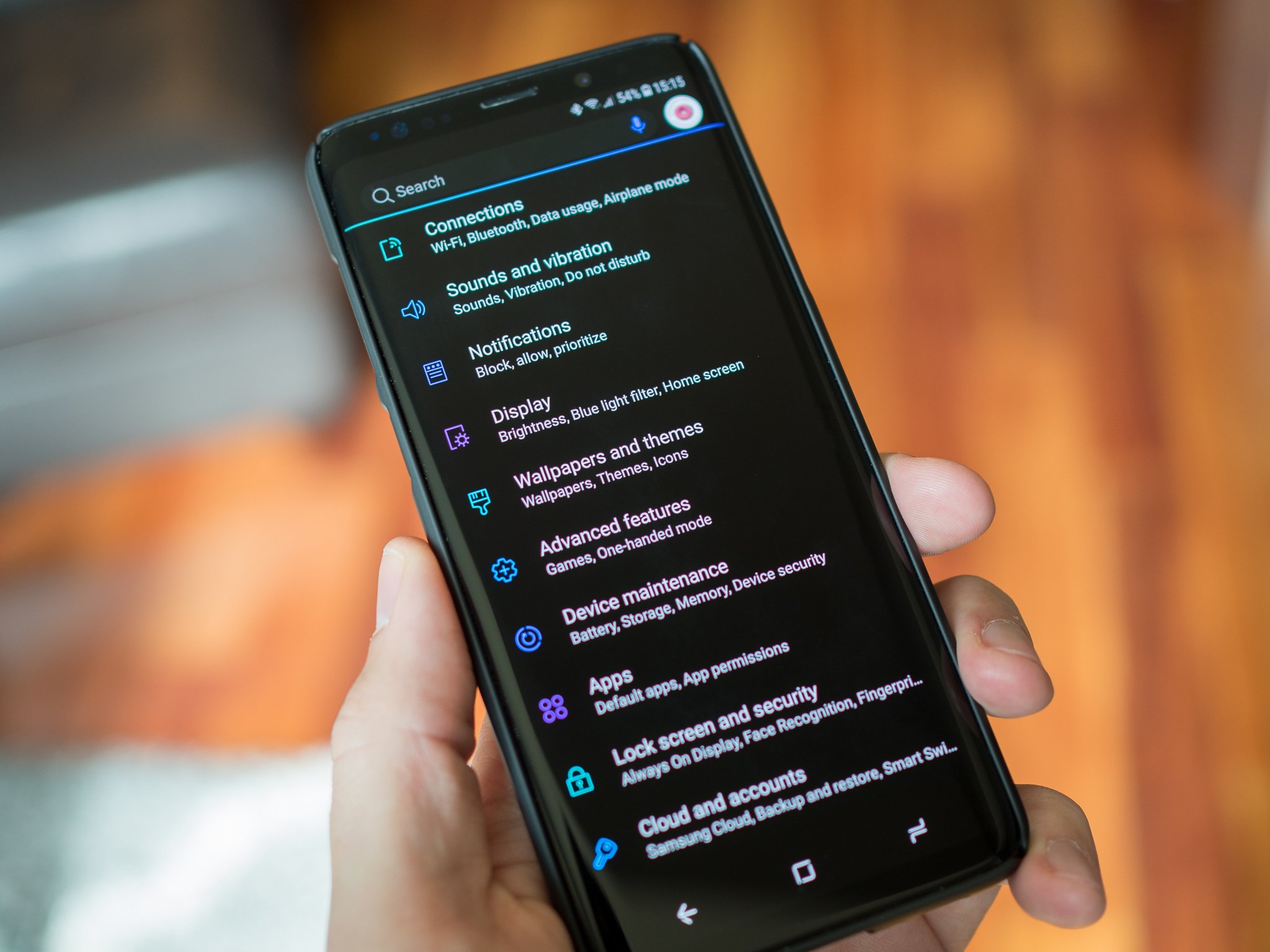
Samsung Themes is the best of the bunch for Android system theming — but it still needs plenty of work.
When I came to Android, back in the Gingerbread era, the world was a dark and glorious place. Everything was black and blue and beautiful. Then the Material era came, and my darkness was stolen away and replaced with searing, sinister white and gray. I've begged for my dark theme to return to me ever since, even dabbling in the dark arts to get it back a time or two. But I always go back to stock and stark white, for better or worse. Luckily, I don't have to: Samsung Themes brought dark themes back to Android years ago, and they're actually pretty dang good.
It's just the rest of Samsung Themes that sucks.
Don't get me wrong. I'm thrilled that Samsung realized that its awful old blue/green color scheme was horrible and allowed us all to ditch it for something a little more appealing. And Samsung Themes utilizing OMS themes like Substratum does (kinda) means that Samsung putting so much effort into its theme engine lays a bigger and better groundwork for all kinds of theming potential. It's just that there are three very glaring flaws in the Samsung Themes engine and its system, and each one of them is fixable, though some more easily than others.
Icon Packs
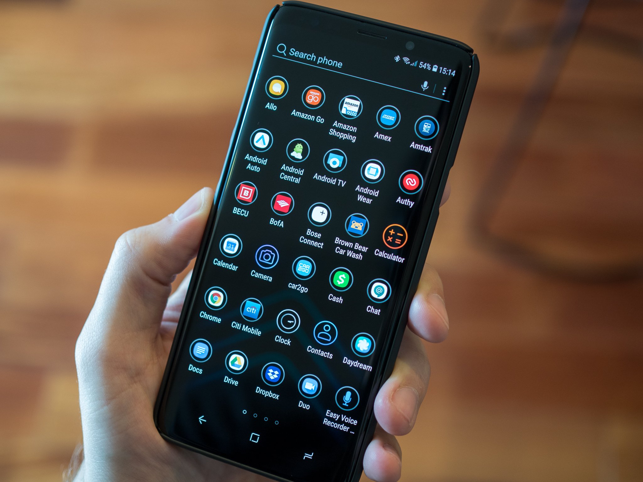
The first problem is the one that most Samsung users can recognize, even if they're not avid and meticulous themers: icon packs in Samsung Themes flat-out fail. They only include icons for a few dozen "standard" Samsung and system apps, and the rest? Well, they get an ugly backer slapped behind them, or worse, get no backer at all. Adaptive icons were supposed to fix the toxic hellstew that is the Android icon space, but they're slow to be implemented and they're still not nearly as consistent as desired.
![]()
![]() ELEV8 on TouchWiz home launcher, ELEV8 on Nova Launcher
ELEV8 on TouchWiz home launcher, ELEV8 on Nova Launcher
For better or worse, icon packs are still the best option for a consistent app drawer, and Samsung Themes' icon packs are pale shadows of their former selves, being vastly inferior to their Google Play versions. The solution to this is simple: allow Google Play icons packs to be used in the Samsung Themes engine. Yes, Samsung would lose some revenue here by not selling the packs themselves, but the icon packs on Samsung Themes are not worth paying for.
By allowing Google Play icon packs, this also means that users who are migrating from other devices and other launchers might be more inclined to give the TouchWiz Home launcher a try instead of immediately downloading their favorite launcher.
Standards and curation
The horribleness of the icon packs in Samsung Themes may stand out because there are no real winners in that category, but it's far from the only section of Samsung Themes that is overrun with terrible elements. Finding good themes and good wallpapers in Samsung Themes is a bit of a needle in a haystack because Samsung Themes is filled up with themes that are just bad. Even some of the highlighted and popular themes look like the work of a 7th grader who just got Photoshop, and I say that as someone who did some horrible things with Photoshop as a schoolgirl.
Samsung Themes needs to keep its numbers up, so it's against their interest to turn away themes or wallpapers for any reason, but without some standards of worthwhile theming content, it's hard to recommend users do any more than find a system theme they like and then switch to a launcher with better theming elements like Google Play icon packs and third-party wallpapers.
Right now, Samsung Themes has about 5% great themes, 5% good themes and 90% meh, and without some worthwhile curation to highlight and bolster the creation of more worthwhile theming content, Samsung's theme engine will languish.
Theme application and backups
If you've read our in-depth guide to theming a Samsung, you will remember than when applying themes in Samsung Themes, you have to go in a very specific order to avoid somehting overwriting another element you want. This is because when you apply a theme in Samsung Themes, it overwrites the entirety of your current theme, from your wallpaper to your icons to your system colors. So changing system themes involves setting that new system theme, and then setting your wallpapers, icons, and the rest of your theme back the way you wanted it.
We need the ability to set Samsung Themes in part rather than in whole, because most users aren't using the wallpaper that came with their system theme, and all of the icons in Samsung Themes are trash, so you'll probably be setting your icons back to Default after setting a theme.
On that same note, Samsung users need a way to back up both their currently set Samsung Themes settings and their home screen layout. Currently, you can transfer your layout from one phone to another via Samsung's transfer tools, but you cannot back them up in case you need to restore your phone and you cannot back them up in order to better facilitate switching between themes.
The best of the worst
For all its warts, the Samsung Themes engine is still the best on the market, but only because it's the most comprehensive engine that doesn't make its users jump through a lot of hoops, look like complete trash, and isn't completely overrun with piracy. Is it sad that this is the bar when it comes to theming a mobile system that is renown for its customization? You bet your bits it is. But until Google gets a better theme engine that's available without taking your software and your warranty into your own hands, it's the best of the bunch.
Let's hope Samsung continues to do it better than the rest.
We can hope Google tries to outdo Samsung, but I've accepted that my wishing for a dark theme on my Pixel is about as useful as wishing to live at Walt Disney World: it would take a miracle.


0 Response to "You Can See More: Everything the Samsung Themes engine still gets wrong on the Galaxy S9"
Post a Comment