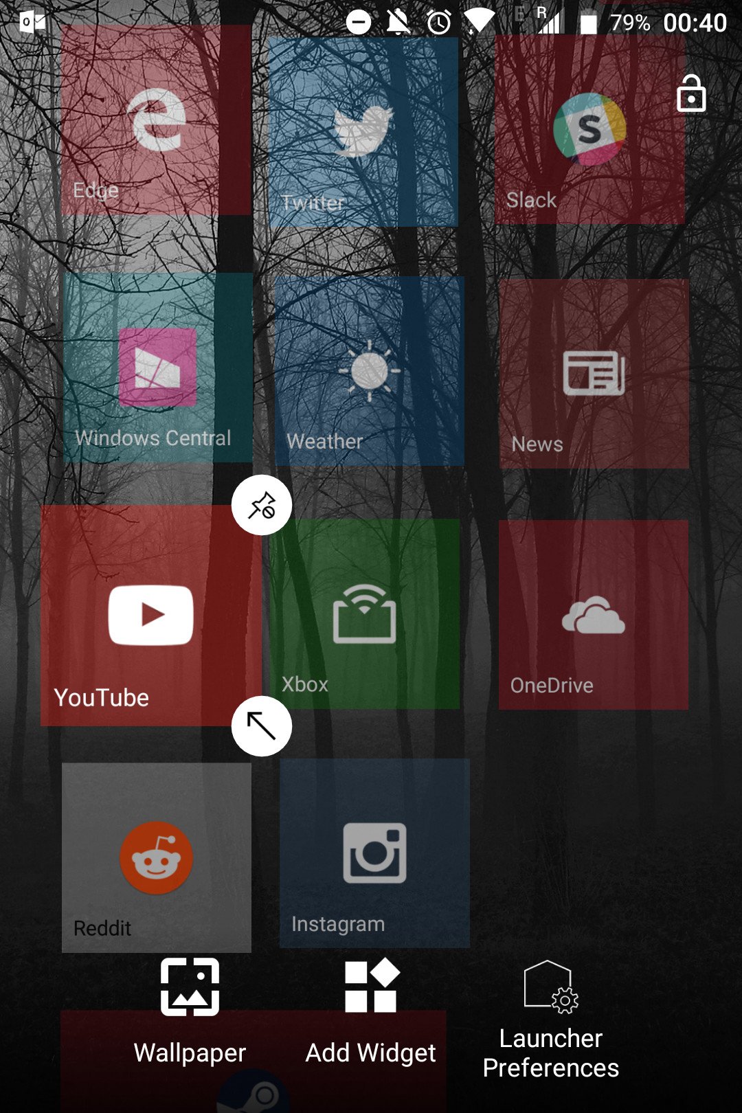
If you just can't let go of Windows Phone, Launcher 10 for Android might be a good option.
The dream of a Windows-powered smartphone is effectively over, leaving some holdovers to make the decision to jump to either iOS or Android. I'm of the opinion that Android is by far the better option in this case, owing to the customizability of the OS for things like replacing the default smart assistant with Cortana, the default browser with Edge, and so on. But if you yearn for a more "Windows 10-like" experience, there are options out there.
You can customize Android with home launchers, allowing you to tailor the functionality of the home screen to your desire. Some of them add special features and other improvements over Android's default home screen, bringing customizable app drawers, widgets, and other functionality. Redmond produces a very robust launcher, dubbed the Microsoft Launcher. However, I'm not a fan. It's just not as sexy as Windows 10 Mobile was. It's all business and no style, which is fine if that's what you're looking for, but I simply wanted something more.
Say hello to Launcher 10, one of the Android home screen options I've been using regularly. It's the closest thing you can get to a real Windows Phone experience on Android today.
Features with feeling
Launcher 10 brings the Windows 10 Mobile home screen experience to Android as faithfully as possible given the restrictions imposed by the OS. Of course, you're not going to get rich picture Live tiles for the vast majority of apps, but Launcher 10's developers cleverly emulated the feel of Windows 10 Mobile where possible.
You can pin apps as tiles on Launcher 10, and with a modest in-app purchase, you can unlock the ability to display notification text and counts directly on the tiles, which very closely mimics the functionality found in many Windows 10 Mobile apps, such as Twitter and Outlook.
The home screen works exactly as you'd expect coming in from Windows Phone.
Additionally, some of the system apps, like Photos and Contacts, come with custom tile experiences that pull information from those apps to create a more Windows-like experience. The Photos tile, for example, will cycle through recent images, and the Contacts tile shows off that familiar scrolling display picture collage.
As for customization, the home screen works exactly as you'd expect coming in from Windows Phone.You can long press to change the position and size of a tile or unpin it completely. Swipe right to access the app list, and then long press to pin apps to the home screen. You can even drag tiles on top of each other to create folders, just like on Windows 10 Mobile and Windows 10 PCs.
Customization and notifications
Just like Windows Phone, Launcher 10 brings many of the tile customization features you might remember, with a few extras.
You can customize the number of tile-columns available far beyond what was available on Windows 10 Mobile, although depending on your screen resolution, you might want to stick with the default three columns, or Windows 10 Mobile's "more tiles" four columns.
You have the option of displaying notification content as Live tiles, which is useful for certain apps. If you dive into Android's settings, you can block Launcher 10 from handling notifications for specific apps, too, giving you a degree of control over which apps show text and which don't.
Launcher 10 also comes with tiles for a pinned system Calendar, showing events. Sadly, my BlackBerry KEYone seems to have replaced the default Calendar app on Android, preventing me from testing this feature. However, the Contacts tile and Gallery Live tiles work well, showing off your contacts and recent images with rich animations that closely resemble Windows 10 Mobile.
There are a few additional aspects of customization that weren't available on Windows 10 Mobile, such as altering the padding space between tiles, the size of text labels, adding additional start screens, and altering which apps use your accent color or simply use a color based on the app's branding.
Downsides
While Launcher 10 has great tile functionality, gorgeous and fluid animations, and some great features, it's sorely lacking in customizability in other areas. For example, there is no option to change the way the Gallery tile handles pictures, as seen on Windows 10 Mobile.
It also seems odd that the app doesn't have the option of using third-party calendars for tiles either, considering it could just be set up to poll the app for information using Android's permissions system.
It would be nice if the app had the option to customize tiles more directly, too, or perhaps provide a framework for developers to bring Live tile functionality directly to the launcher, although that probably wouldn't be practical.
In closing
You're never going to get a full Windows 10 Mobile Live tile experience on Android, due to the OS limitations, but Launcher 10 is a damn fine attempt to recreate that magic Windows Phone fans yearn for.
Launcher 10 is frequently updated. It offers a free trial, and a couple of cheap in-app purchases for Live tile functionality and the ability to remove ads are in the settings menu. It's a polished product that works well even on more modest Android devices, and although it has clear limitations that might frustrate Windows Phone veterans, it's as close as we can get on Google's platform.
What launchers do you use on Android? Let us know in the comments.


0 Response to "You Can See More: Launcher 10 brings a dash of Windows Phone to Android"
Post a Comment