One of Google's standout features has been left to die, and that's sad to see.
Google Now used to be really useful. It used to be so good that I only used Google Now Launcher on every phone because I needed to have Google Now just a swipe away on my home screen. Any other launcher felt like it was keeping me disconnected from information that I relied on every day.
As we turned the calendar over to 2018, and just spent a week at CES 2018 seeing a huge emphasis on Google Assistant, it looks like Google's happy to let the traditional Google Now feature set — aka the "feed" — wither and die. In the past six months, Google Now has gone from a must-have feature to something I have stopped looking at regularly and even forgotten about for days at a time. It's no longer helpful, insightful or useful.
Every morning, I used to unlock my phone, swipe to the right on my home screen and scroll through Google Now. I'd get updates on the weather, traffic, sports scores, upcoming calendar events, reminders about important emails and more. Throughout the day, when something was really important, I'd get a notification telling me about it — things like a stark change in the weather, an accident on my route to an appointment or breaking news.
Google Now used to be the start of my daily routine; now it's an afterthought, at best.
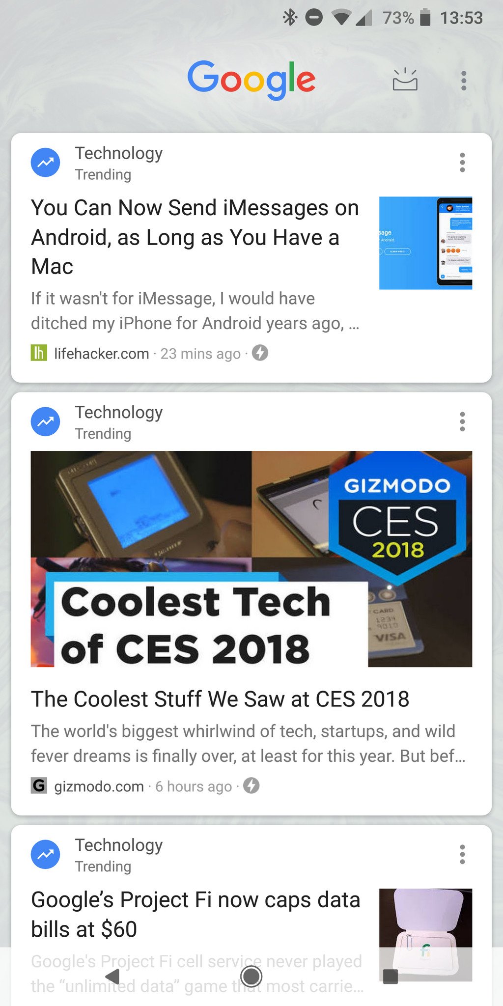
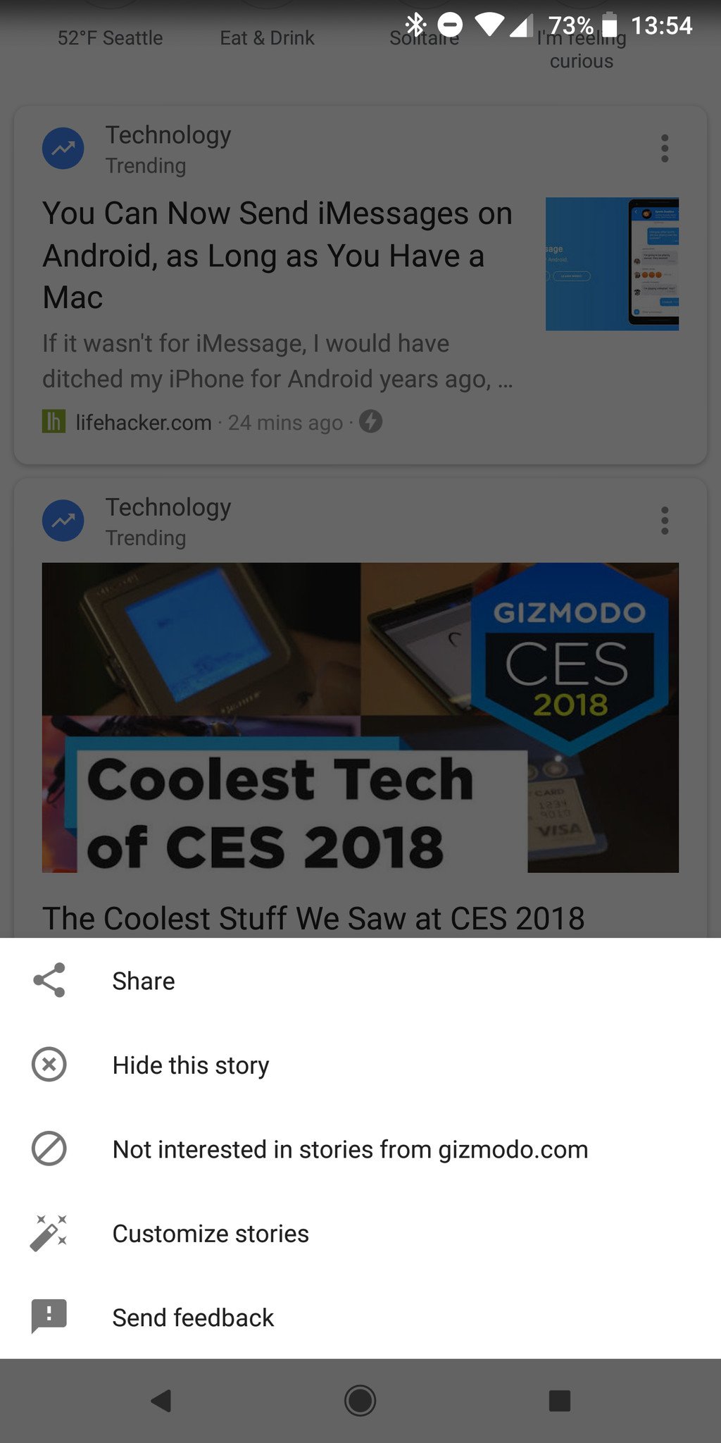
Now, my engagement with Google Now (ahem, feed) is sporadic and mostly disappointing. Swiping over on my home screen today shows me ... just a bunch of poorly-targeted news stories. Some based on things I like, others perhaps tangentially so, and many that are clearly jumping out on a limb to show me what's "trending" even though I have no interest in it. How did the once-wonderful Google Now turn into the same annoying throwaway feature as Samsung's Flipboard Briefing and HTC's News Republic in BlinkFeed?
Google Now no longer shows me a single piece of information on appointments, calendar events, commute times or anything of the sort. I rarely get reminders for upcoming events or bills or other information from Gmail. There's one small card with upcoming weather, but that's just about the easiest possible thing to show and is available anywhere.
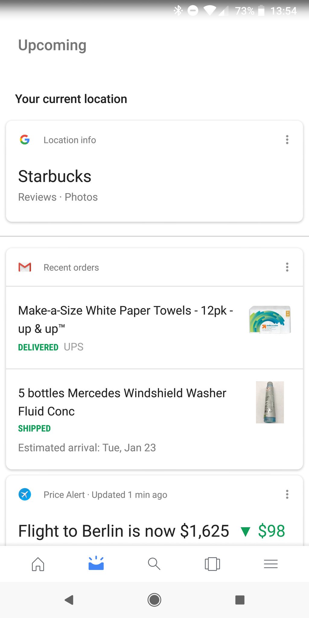
A subset of these things has been moved behind an "upcoming" button — one that's found in different places depending on your phone and launcher — and even in here I don't get the same great layout of up-to-date information at a glance that I once had. It's not even close, actually. This was the reason to use Google Now, and it's relegated to a second press and a different interface, entirely removed from the spontaneity and immediacy of being right there next to my main home screen. The useful notifications, too, have disappeared. At best I'll get a reminder about a sports game starting or a big drop in a stock ticker I've searched. Sigh.
What the hell is Google doing with the Google Now feed? Ignoring it, as far as I can tell.
As Google Now dies a slow death, Google Assistant has of course taken the focus. Many of the core features of Google Now in terms of following what you do and what you like to tailor answers and information to you in particular is integrated into the new Assistant experience. It works across a variety of devices, with and without screens, and does so primarily with voice interactions — and that's precisely the reason why it can't replace Google Now in the way I used to love it. Google Assistant works great for a question and answer, or a short interaction with a couple of phrases — but the number of visual interactions are extremely limited, as are the ways that Assistant can "push" information to you when you need it.
The 'old' Google Now and new Google Assistant can work together in harmony — and that's what I want.
In many ways, the "old" Google Now was a far better assistant than Google Assistant is today. Today's version of Google Assistant is sitting there, waiting to help you when you ask it to — and it's ridiculously smart when you do. But a proper personal assistant does things before you ask, and has information waiting for you before you're ready to see it. Google Now may not know if you prefer coffee or tea in the morning, but it will prepare both before you're out of bed; Google Assistant knows your drink preferences, but it sits there and waits for you to wake up, shuffle into the kitchen and say "Google, make me some coffee" before it does anything. That's a key difference in user experience.
With how little the two services actually overlap, it wouldn't be a stretch to think that they could be put together on your phone. Bring back Google Now as it once was: a visual feed of super-useful information based on all sorts of data Google has about you and your habits. Stop pushing piles of useless news that I don't care about, or let me turn it off entirely. And take this renewed respect for how good Google Now was and put it dead-center with the Google Assistant's interface on my phone. When I talk to it, give me the Assistant's voice commands and knowledge base. But if I just want to scroll and see what's there for me before I even ask, let me have it in the same place.
Until then, I won't be using Google Now anymore.


0 Response to "You Can See More: Google Now is being left to wither and die as Google Assistant takes the focus"
Post a Comment